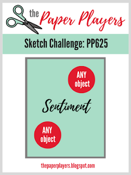
Joanne has presented us with a new Sketch Challenge #PP625 at The Paper Players! I started my card with the need to make a thank you card for a very thoughtful gift I received from my husband's nephew and his wife.
Both images on this card are from the same large floral arrangement (#PR101 Hero Arts + Gina K), using the upper part of the arrangement for the lower left and the bottom placed sideways at the upper right. I stamped them in Memento "Tuxedo Black" on a white card panel. After stamping, I die-cut the panel with a stitched rectangular die and then cut it a second time with a smaller double-stitched rectangle. I mounted the original black and white frame to a card base and inserted a blank in the rectangle cut out from the face. I colored the roses and leaves on the smaller rectangle, added a silver-embossed sentiment (PTI "Embroidered Blooms"), and glued the colored images onto the face of the card with a layer of dimensional foam. The final touches were 3 small pale pink sequins and some tiny silver dots at the little buds in the leaves. Here's a view that captures the shine a bit better on the sentiment and sequins:
On a personal note, I found Joanne's sketch to be a bit difficult - isn't that the purpose of these challenges? I guess my years of designing interior spaces got the best of me - I can't stand to see area rugs that are hanging out away from furniture. Interior designers insist that the rugs and furniture need to overlap, and I tend to apply that same principal to my cards! Take a look at all of the design inspirations from our talented team, and you'll see the same "designer's rule" holding with each of their cards, whether it's layered individual elements or a background that pulls everything together.
I'm anxious to see how our followers approach this sketch - maybe someone will prove me wrong and do a fabulous card with no overlapping elements!
https://paperplayersprivateblog.blogspot.com/2022/12/jan-29-pp625-sketch-joanne.html
A later note: I may try to do this card again - this next time heat embossing white on a black or gray background as a frame, combining it with the white panel overlaid. It wouldn't necessarily be in line with Joanne's sketch, but it would make an interesting positive/negative project. Hmm. Watch this space!


Fran, your card is just so lovely! The design, the elegance and the shine are all so eye catching.
ReplyDeleteThank you, Cindy!
DeleteThis is such a beautiful card! Interesting interior designer notes too!
ReplyDeleteHi Fran, Your card is lovely and the design comments are inspiring too. I will check out the gallery with a new insight now. Your design is a fabulous and elegant take on the sketch.
ReplyDeleteDespite your misgivings, I think your card is STUNNING. Beautiful executed and I love the layers.
ReplyDeleteThank you, LeAnne!
DeleteYou worked you design magic with this, Fran is beautiful!
ReplyDeleteFran, Your card is just gorgeous. Well done!
ReplyDeleteFran, I wouldn't have thought you were scared of this sketch at all! Your card is gorgeous. I love how the layers overlap. The stitched border die adds interest without detracting and forces your eye to move around the card. Just gorgeous. Oh... and so agree on the design choices - my pet peeve - furniture placed along the walls with a coffee table placed in the middle that no-one can reach!!! and yes, my carpet and furniture do overlap :-).
ReplyDeletehugs
jaydee
Firstly - I just love this card Fran! The soft pink and grey adds such a delicate feel to your flowers and I love the way you created a split frame. I would love to see another version of your card - I think a reverse with white and navy would look lovely too. I loved reading your interior design insights; when I designed the sketch I went with something quite pared back and basic, really because I just wanted to see how everyone would interpret it! Like you I generally will overlap elements as I instinctively don't like to leave things 'hanging in thin air' - I too have carpet and furniture that overlaps!!
ReplyDeleteAbsolutely stunning, Fran! If I received this card, I would frame it. I enjoyed reading your interior design insight. It will be fun to check out the gallery keeping this in mind!
ReplyDeleteAbsoluty gorgeous card 🤩💐👏👏👏 happy day
ReplyDeleteFran, this card is gorgeous! I love the gray and pink flowers and they way they overlap the layers. Your stitched die adds so much detail! The silver embossed sentiment and little sequins are the perfect finishing touch! Have a wonderful weekend! Your rocked this sketch!
ReplyDeleteFran, this is stunning! Love the crisp, clean design and the embossed sentiment really adds that perfect finishing detail. Wow!
ReplyDelete