Saturday, May 28, 2022

W IS FOR WICKED

Another fun Guest Designer spot at The Sisterhood of Snarky Stampers, where I am currently reigning as Queen of Snark! This new challenge is #211 "W is for Wicked" and I had great fun with my card. I kept thinking of the wicked witch of the west and found this quote from the musical "Wicked". 


The stamped image is "Fifties Girl" from Lost Coast Designs. I stamped her with Memento "Tuxedo Black" ink and then colored her lipstick and stamped just her shoes with VersaMark ink and heat embossed with Stampendous "Red Tinsel" embossing powder to make ruby slippers. Then I fussy cut her and her ruby slippers out and mounted her on the front of a black slimline card that I had heat embossed with white splatters from Tim Holtz. The sentiment was created with my computer and mounted to a red mat.

Hope you all have as much fun with this as I did!

Sisterhood of Snarky Stampers: SoSS #211: W is for Wicked


Thursday, May 26, 2022

TIC TAC TOE GUEST DESIGNER

Hello, this fine beautiful spring day! Today I'm Guest Designer at the Tic Tac Toe Challenge. This week's Challenge is #163 and I chose the middle row - Birds/Ribbon/Add Texture.  While making this card I was thinking of the tiny little chickadees and finches who visit our birdfeeders all winter and into spring. I haven't seen them for a couple of weeks, so I'm assuming they're nesting and finding plenty to eat.


I began with a white side-folded card base and a white panel that I embossed with a Cuttlebug embossing folder and die-cut with a stitched rectangular die. I wondered what would happen if I embossed a pattern and then colored the high points with Copic markers, so I experimented with another embossed panel. I liked the simplicity and decided to keep the card simple and sweet and wanted to use the ribbon as a closure with a tag. The sentiment is from PTI's "Winter Hills", and the tag is die-cut from the same collection of stitched rectangles as I used for the panels - Dare 2B Artzy "Rectangle Framelits". I attached the top colored panel with pale green mat to the card with dimensional foam and threaded the satin ribbon through a punched hole at the edge of the top panel. The sentiment says it all!


It's been a pleasure to make this special card for the Tic Tac Toe Challenge and I look forward to seeing everyone else's beautiful cards.

TTTC163 - Featured Designer Silke - Tic Tac Toe Challenge


Wednesday, May 18, 2022

NEW HOME CARDS

I'm continuing my playing with producing New Home cards for my son's real estate business and using a couple of challenges as inspiration for the layouts. My plan is to design about 5-6 different basic designs and then to change them up with different colors and papers. This one began as a desire to participate with the Less is More Challenge #464 - "Use a Tag" and then segued into The Paper Players Clean and Simple Challenge from Laurie - PP591 "House". This is my first time joining The Paper Players.


Last week I found this wonderful light-weight house printed paper on sale at Joanne's from American Crafts and I used it as the inspiration for the colors of the card. The envelope was in my stash, along with some odds and ends of pink parchment cardstock. 

I sort of worked backwards with this card by starting with the little scene in white cardstock on iridescent aqua linen cardstock. I die-cut a small, stitched rectangle (Dare 2B Artzy "Rectangle Framelits") in the aqua and then using a couple of Lawn Fawn's stitched curves and sky dies, I layered a slightly smaller rectangle on the aqua one, adding the little house and trees from Alexandra Renke's #D-XX-AR-W0128 Winter Village and a picket fence from Nellie's Choice #SD214. Finally, I punched a hole in the top of the aqua rectangle and threaded a length of white satin ribbon and a small tag that I had heat-embossed a sentiment from PTI's "Tiny Tags" with some aqua Zing! embossing powder. I fabricated the small tag from Dare 2B Artsy "Rectangle Framelits" by die-cutting it and then sending it back through my die-cutter to shorten it and adding a small heart. My final step was to stamp the sentiment from wPLUS59 "Neighbors" with moss green ink to the face of the card, mount a stitched white cardstock rectangle above it and add the aqua scene and tag with a bit of dimensional foam.

While this was basically CAS, it felt like it took me most of the day, while waiting for someone to show up and repair our heat pump. 

"Less is More": Challenge #464 - Use a Tag (simplylessismoore.blogspot.com)


Sunday, May 15, 2022

BUTTERFLY SHAPED CARD

YIKES! Carol at Just Us Girls has really thrown a complex challenge at us with this week's Trend Week #632 - Shaped Cards. Well, actually I made it more difficult for myself because I don't have any large shape dies for an entire card. The only thing I could find is my old Kaiser Craft "Butterfly" stamp and die.


The custom envelope I made to fit this is 4" x 4-1/2" and the card is slightly smaller. I can't begin to explain all of the steps for this card. After trial and error, I figured out that the best way to fabricate this was to fold the card stock and situate the die so that it folded at the top of the wings. This made a strange shape with the antennae cut off, so I decided to stamp and die-cut a second full butterfly and glue it to the face of the card. Then it wasn't complicated enough, so I stamped yet a third one, die-cut sections of the wings, and colored them with my Copic markers. I glued those next to the body and raised them up for dimension and then heat-embossed the body with black embossing powder, colored it, and fussy-cut it out to glue over the wings. The little tag is heat-embossed with a PTI "Beautiful Butterflies" sentiment, using Zing! "Powder" and threaded under the body with satin ribbon.

And if anyone thinks I cheated and just did a single flat card, here she is standing up:


I don't think I'll do that again anytime soon - it literally took me half of the day! (I think I deserve a master's degree in card engineering, or at very least a lunch break!) My husband has asked to keep this, so I stamped a "Love You" onto a light coral die-cut heart and attached it inside. 

Here you are, Girls:


Added May 20, 2022:


Saturday, May 14, 2022

HAPPY NEW HOME

I think I mentioned previously that my son is a real estate agent, and he has asked me to provide handmade cards for himself and his team members when they sell homes. I'm working on a set of several designs, and I was thinking about that when I made this card. However, I think this particular card might be a bit more elaborate and layered than I'll be wanting to produce in multiples. As inspiration I used Freshly Made Sketches #535 - a sketch by Amy O'Neill, changing the format to a horizontal one.   


I used a couple of different textured ecru watercolor papers for the card base and top panel. The printed paper I used on the face and to line the envelope is from my stash of scraps. The sentiment die and stamp are Hero Arts #DC274. The house is cut from woodgrain cardstock with Nellie's Choice #SD214 and the trees are Alexandra Renke's "Winter City". The stitched circle is from LDRS Creative. What doesn't show in this photo is that the stamped sentiment, mat, and windows of the house are all metallic gold.


Here's another challenge that seems appropriate for this card, since there are multiple die-cuts:


Wednesday, May 11, 2022

8TH BIRTHDAY

Inspired by AAA Cards Challenge #214 - Moodboard + Birthday (the challenge is now 8 years old!), I made a birthday card for my youngest granddaughter, who will be 8 in a couple of months. I think this is probably border-line CAS, but I wanted to share it anyway. I don't recall what you call this when a word is spelled with both letters and numbers, but you don't know it until it's spoken - ? Her name is Kaitlyn and she's pretty precocious, so I'm sure she'll catch on!


I used a full 8-1/2" x 11" piece of white cardstock, folded and trimmed off 3/4" from the bottom - so the stripe printed paper is actually on the inside surface of the card. I stamped and heat-embossed the sentiment with purple Zing! embossing powder. The stamp is from Lawn Fawn's "Scripty Sayings". I used cardstocks from a paper book with lots of juvenile designs in it with raised and sparkly patterns. One sheet is full of the letters and I just cut them out individually and die-cut the number 8 and the balloons from PTI's "Bithday Bash" and numbers. The top panel is matted with dark purple. Before attaching the number, I stacked about 3 more layers with white cardstock for dimension.


Well, happy birthday AAA Card Challenge and Kaitlyn!

AAA Cards: Game #214: Moodboard + Birthday


Tuesday, May 10, 2022

COLOR THROWDOWN 692

I have the honor this week of filling the role of Featured Stamper at Color Throwdown #692. This week's colors are pink, lavender, gold, and white. I would have liked to make a layer cake like the one in the CTD photo with butterflies atop, but alas I don't have any cake stamps or dies. That's something that clearly needs to be remedied! 


I did stick with the obvious and stamped a butterfly from an old clear stamp set with Memento "Grape Jelly" ink on a panel of pink cardstock that I had die-cut with a stitched rectangular die. I colored the wings with lavender and pink Copic markers and smudged a bit of purple ink with a small blending brush. Once that had dried sufficiently, I over-stamped the sentiment (WP684 "Leaf Set" from Impression Obsession) with VersaMark ink and heat embossed with Stampendous "Pirate Gold" embossing powder, which I also applied to the edges of the top layer. The final step of the top panel was to add a bit of white gel pen markings. The second layer was die-cut using my new Tim Holtz/Sizzix deckle edge dies, and this was layered over pink and white mats, and all of this attached to a pink top-folded card base. No layered cake, but definitely a layered card!

Color Throwdown: Color Throwdown #692


I'm looking forward to seeing the cards that come out of this inspirational photo! 

Saturday, May 7, 2022

TIC TAC TOE CHALLENGE

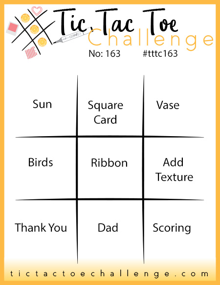
While my personal design style tends strongly toward CAS, I do occasionally enjoy pursuing more elaborate and decorative designs - such as today's card. I haven't participated with the Tic Tac Toe Challenge for a while, so looked in on their blog for inspiration. The current game board (TTTC160) by Vicky Hayes has plenty of opportunities for inspiration and I used almost ALL of them! I'm just missing silver and pearls, but maybe the iridescent papers I chose fill in for pearls. 


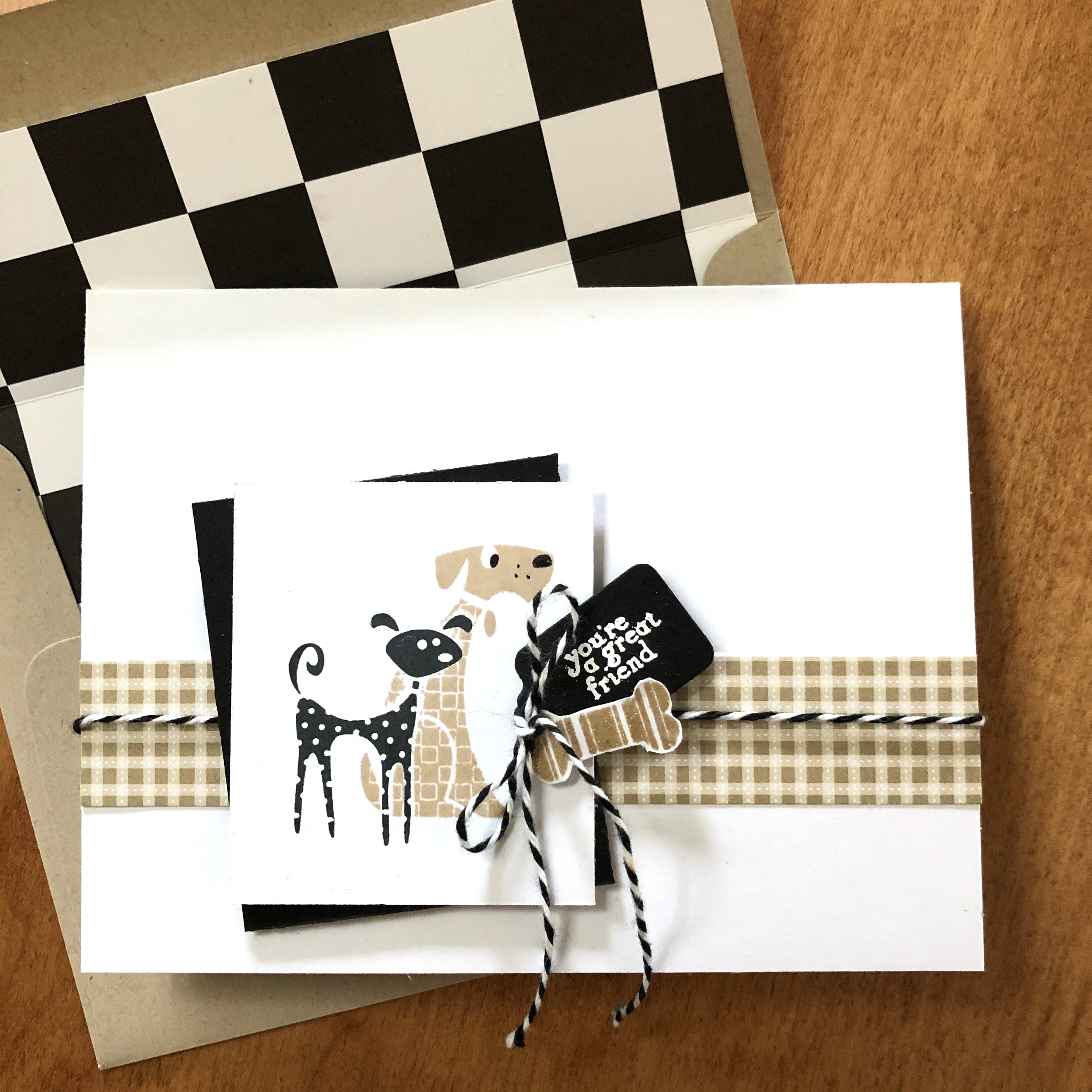
I had some scraps that I have played with for several years, blind embossing patterns into an iridescent linen-weave card stock and then not using them. A couple of weeks ago I fashioned a small envelope from one of the scraps and lined it with some gold vellum with the idea to fill it with flowers for the front of a card - it's been sitting on my desk since then. Looking at the game board I realized that I could do a white-on-white with die cuts and gold. I started with a gold metallic card to which I glued an embossed scrap that I die cut with my new Tim Holtz/Sizzix deckle edge rectangle. I also used a smaller rectangle for a scrap of linen-weave iridescent white card stock that I matted with gold metallic velum and layered that onto the card face along with the original small, lined envelope. I filled the envelop with die cut flowers and leaves from Alexandra Renke "Astrella" and "Myrtella" and attached 3 tiny die-cut gold vellum butterflies. The final step was to bind a folded vellum interior page with white satin ribbon. (The light is low today, and the white ribbon took on a gray cast.) 


I haven't used a sentiment on this card yet because I really don't know how I will use it - maybe a 50-year anniversary or a wedding. When I need it I'll add a sentiment and inside message.

TTTC160 - Featured Designer Vicky - Tic Tac Toe Challenge


Added May 14, 2022:


Friday, May 6, 2022

BLUE BUTTERFLIES

I'm back with a second card today and this time I'm using Fusion Colour Palette: Blue Butterflies as inspiration. We're joining our daughter-in-law's family at their annual Mother's Day weekend campout tomorrow, so I'm making Mother's Day cards for all of the mothers in attendance. 


I stamped my butterfly (Kaiser Kraft) twice - once on the card base with PTI "Enchanted Evening" and a second time with heat embossed Stampendous "Cobalt Blue". I colored the heat embossed images with my Copics markers and cut out a banner to overlay with dimensional foam. The sentiment is heat embossed and the little butterfly is from PTI's "Beautiful Butterflies" set, stamped with their "Hawaiian Shores" and "Blueberry Sky" inks. In retrospect I wish I had used an ivory or textured cardstock for the banner, but oh well!

 Fusion Card Challenge: FUSION - Colour Palette: Blue Butterflies


Added May 12, 2020:


WOOF!

The primary inspiration for today's card is Inkspiration #264 - Word Prompt "BARK", but it occurred to me that I can also participate in the current Addicted to CAS #219 "Friendship"


The dogs and bone are all from an old Inkadinkadoo set I've had for years, although I don't think I've ever used these particular dogs before. I started by stamping the black puppy with Memento "Tuxedo Black" and masking him off to stamp the tan dog with Altenew "Rocky Shore" on a square cardstock scrap. I attached a strip of kraft plaid paper to the face of a top-folded white card and layered a black square and the stamped image over with dimensional foam, after punching a small hole to feed twine through. I die-cut a black tag, white heat-embossed the sentiment, fussy-cut a bone, and tied all of these up with the twine.
 

Wednesday, May 4, 2022

THREE FOR ONE

This evening's offering is a "threefer", meaning it's an appropriate submittal for three challenges: 1) Casology Week 403 - "Botanical", 2) Freshly Made Sketches #534 - A Sketch by Cécile, and 3) Less is More "One Layer Card - Off Center"


Last week, against the recommendations of my "better angels", I bought some new stamps and dies. I'm still trying them out. This stamp set is from Hampton Art and may be #SC1013, but it's not well-marked on the package. I started by stamping with VersaMark Watermark and heat embossing with Stampendous "Pirate Gold" embossing powder. I then went back in with my Copic markers and colored all of the poppies and leaves and envelope, after which I over-stamped and heat embossed the sentiment with a red-orange embossing powder that I had custom-mixed of red and orange embossing powders. The final step was to mask the entire image off and blend a masked circle background using a Tim Holtz stencil and PTI "Soft Stone" die ink. Obviously, it is a single-layer card on Strathmore watercolor card stock with matching envelope.

The metallic gold character of the card doesn't show off in the above photo - here's another shot that also shows the shine of the sentiment embossing:


Time for bed as I enter this into the following challenges:

CASology: Week 403: BOTANICAL


Added May 11, 2022: