Showing posts with label Snark. Show all posts

Saturday, May 3, 2025

RUDE BIRTHDAY WISHES

"R is for Rude" - that's what challenge #262 is this month for The Sisterhood of Snarky Stampers where I am May's reigning queen! You can see that Edna stands ready to pass judgement on the level of rudeness of all of our cards:

Sisterhood of Snarky Stampers: SoSS #262 - R is for Rude


This card started with a top-folded white card base onto which I stamped the first Tim Holtz Snarky Cat in the upper left corner in black ink. Then I masked him off and stenciled the background with PTI "Stormy Sea" dye ink, using a Tim Holtz stencil, and colored him. Then I stamped, colored, and fussy-cut the remaining three cats. The one in the center was glued directly to the card face, along with the sentiment ( Unity Stamp Company "Purr-ty Cats"). The final step was to add the last two cats at each side with a bit of dimensional foam. I also prepared a custom envelope and lined it with a piece of white paper that I stenciled using the same Tim Holtz stencil.


My son will be getting this card early next month on the event of his 51st birthday! AND because this card features both stencilling and birthday wishes, I'm sharing it with the gang over at Seize the Birthday (my spellcheck doesn't like that spelling of stencilling, but I checked the dictionary and it's acceptable).

Seize the Birthday: Seize the Birthday # 304


Wednesday, November 27, 2024

A BIT OF HOLIDAY SNARK!

Feeling snarky today, so where best to express that than over at Sisterhood of Snarky Stampers? The November challenge is "C is for Critters". For layout, I am going with CAS Colours & Sketches: Challenge #549 - Sketch


I started by computer generating the sentiment and printing it out, trimming it, and attaching it to a red scrap. I glued the sentiment and red strip to a piece of white cardstock and die cut it with a stitched rectangular die. I stamped some Tim Holtz Snarky Cat images with black ink, colored, and fussy cut them. I mounted the rectangular panel to the face of a white card base, after attaching the milk jug, fish bone, and cat.

Sisterhood of Snarky Stampers: SoSS #256 - C is for Critters


CAS Colours & Sketches: Challenge #549 - Sketch


Added December 10, 2024:


Saturday, October 5, 2024

H IS FOR HALLOWEEN

Okay, so I lied - another Halloween card! But how could I not play along over at Sisterhood of Snarky Stampers where the challenge is "H is for Halloween"?


I started with a white panel on which I stamped a zombie background from Whimsy Stamps with black ink. Then I over-stamped some drippy blood from an old bloody stamp set from bygone years. I trimmed the panel by die cutting it with a deckle-edged rectangle and grunged up the edges a bit with some black ink and matted it with some red cardstock. I mounted both layers to the face of a black card base. I white heat embossed the sentiment from Tim Holtz on a black strip and glued it over the blood. The final step was to color one of the faces of the background paper, fussy cut it, and attached it over the black strip.  

Sisterhood of Snarky Stampers: SoSS #255 H is for Halloween


Added November 6, 2024:


Saturday, September 21, 2024

HALLOWEEN #2

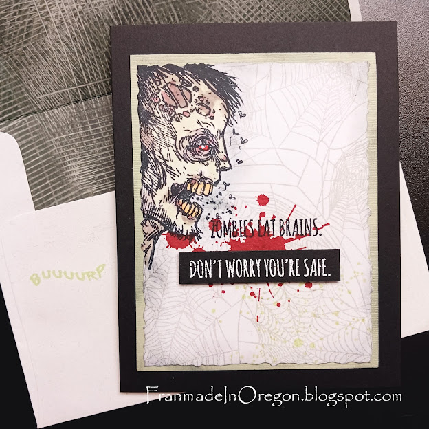
Well, I'm on a roll with Halloween cards today and having fun with TIME OUT Challenges #272 - "Snarky". Snark happens to be one of my favorite forms of expression - Halloween or otherwise! 


I used an image from Whimsy Stamps #CWSD388 "Zombie Party" and he's pretty disgusting! I stamped him in black on a white panel then masked him off and stamped a pale gray spider web background from Impression Obsession. Then while he was still masked off, I overprinted blood splats and green spatters. After coloring him with my Copic markers, I over-stamped the first line of the zombie sentiment from Tim Holtz and die cut the panel with a deckle rectangle. I smeared some light ink around the edges and mounted the panel to a green mat that was also smeared and smudged a bit. Once this was completed, I white heat embossed the second line of sentiment onto a black panel and trimmed it. I attached the black rectangular sentiment to the card with a strip of black foam dimensional tape.   
 

The envelope was a slightly off-white one from my stash that I lined with printed paper and stamped the 'BUUUURP' sentiment in green just below the edge of the flap. This is one of the sentiment lines from the Zombie Party stamp set.

That should do it for me today!

TIME OUT Challenges: Challenge #272 - Snarky


Added October 3, 2024:


Sunday, August 4, 2024

'S' IS FOR SUMMER

WOW, two days in a row with new cards to share! Today I'm inspired by the ladies over at the Sisterhood of Snarky Stampers. A lot of the challenges are featuring summer and summer travel right now, but I'll just stay with the snarky ladies because I'm not sure the other challenges would appreciate my sailor's mouth on the inside of my card!


I was thinking about a couple of years ago when three other lady friends and I went off to a week in Kauai, leaving our spouses behind. I would have loved to have this card at that time to send to my husband back home holding down the fort.


I used a new sun stamp I found in a sale when I went searching for tropical images for the cards from yesterday. I masked off a horizontal line on a piece of white cardstock and stamped the image (Hero Arts #H6356 "From the Vault Etched Serene Sun") with PTI "Orange Zest" ink and colored the image with yellow and orange Copic markers. The next step was to create the water with Hero Arts #CM316 layers, using several gray and blue tones. Then I went over the waves with a bit of blended yellow and a bit more blue and blended a sky. I over-stamped the sentiment with some dark gray and glued my creation to the face of a top-folded square card base. I die cut a frame from the same card stock and attached it over the image with dimensional foam.

Inside, I generated the sentiment on my computer, die cut it with a square die, blended a bit of blue for sky, and added birds from the same stamp set as the waves. I double-matted the square with a bit of lighter orange scrap and white cardstock and attached it to the inside. Finally, I fussy cut a couple of empty Adirondack chairs and glued them to the inside.  

So, here's where this card is headed:

  Sisterhood of Snarky Stampers: SoSS #253 - S is for Summer


Friday, June 28, 2024

GETTING MY SNARK ON!

I've been contemplating the latest Sisterhood of Snarky Stampers #251 - "D is for Die Cuts". Today I have some time on my hands, so I headed into the craft room for further contemplation. The idea I decided to pursue was to make a really pretty card and contrast it with a snarky sentiment. How do you think I did?


I used one of my favorite techniques, which I guess is called "spotlighting", starting with a 5-1/2" square top-folded white card base. Using a floral stamp from Hero Arts + Gina K (#PR101), I stamped it on the face of the card base with PTI "Soft Stone" ink, plus 2 more times on additional card stock squares. I won't go into all of the technicalities - just suffice it to say it took a bit of engineering to get all of the layers die cut with the selected square dies and trimmed to fit the card base in graduating layers. I colored the roses on the original card front with my Copic markers and over-stamped the Unity Stamp "Itty Bitty" #IB-948 and heat embossed it with silver powder. Before assembling the card I silver-embossed the outer edges of the second layer and die cut a small row of stitching holes on the colored area to pull some silver threads through.  


The final step was to assemble all of the layers and glue them to the front of the card and attaching a small die cut heart over the stitching. This photo gives a better look at the metallic silver elements:


So here's a link to Edna's invitation to join her with your creative die cutting project: 

Sisterhood of Snarky Stampers: SoSS #251 - D is for Die Cut


On a personal note: Sometimes to amuse myself, I check the Urban Dictionary for their definitions. I looked up "snark" today and came up with this - "A smart ass remark made by wanna be hipsters who think they cloak their douchebaggery in a self important sense of fey cleverness and ironic witticism." OUCH!! 

Saturday, April 6, 2024

F IS FOR "FOLD IT"

Here I am at Sisterhood of Snarky Stampers for a repeat Guest Designer slot! This month Challenge #249 is "F is for Fold It". You can see that Edna has made herself a hat to wear for this challenge. Do you suppose it's lined with tin foil? 

Sisterhood of Snarky Stampers: SoSS #249 - F is for Fold It


I won't pretend that this challenge was easy! I started with a completely different idea (you'll find that at the end of this post), but scrapped it because it felt like it had too few folds. I knew I wanted to start using up these paper dolls from Tim Holtz that had been languishing in my stash for a couple of years. I use one once-in-a-while, but wanted to use a bunch of them. There are a total of 19 people + a dog, so there's only a handful of them left - stay tuned! 


I'm not sure what this fold is called, but I've played with it a couple of times - maybe a standing accordion fold? When compressed it's approximately 5" square. It took 3 sheets of chocolate paper trimmed to 5" strips to complete all of the folds. The sentiment is from AALL & Create (#771 "DEE Quips"). The envelope is a custom one.

The card I made initially for my husband is a much simpler fold. I folded an 8-1/2" x 5-1/2" card base in half with the fold on the right, then turned back the right side. I added tan panels to both layers and glued on the figures so that they slightly overlapped.


When opened, the second part of the sentiment (AALL & Create #771 "DEE Quips") appears with a pile of wine bottles (Unity Stamp Co.). This card was so hard to photograph. Showing the fold really distorted the image. 

Monday, February 19, 2024

W IS FOR WINTER

I was inspired to make a "winter" themed card based on the latest challenge at Sisterhood of Snarky Stampers #247 "W is for Winter". I made the card a couple of days ago and then encountered many technical glitches - we ended up with no internet for a couple of days and my photo software just quit working. I'm not very good with technology, so it's been a bit frustrating to get here with this photo!  


Having said all of that, this project started with a white top-folded card base on which I attached a gray embossed panel with swirls. I added some white gel pen to the dots on the embossed panel. I used a bunch of the zombie silhouettes from Whimsey Stamps #CWSD388 ""Zombie Party" and stamped a row of them in Memento "London Fog" across the center of a gray panel and then over-stamped four more figures with black ink. The snow was added with Tim Holtz splatters from a Halloween set and the sentiment is from Impression Obsessions #CS1082 "Zombie Sayings" - both the splatters and sentiment were white heat embossed. The panel was then die cut with a deckle edge and matted with black. I love this sentiment and have used it several times over the past couple of years! 


Sisterhood of Snarky Stampers: SoSS #247 - W is for Winter


Added March 5, 2024:


Thursday, February 1, 2024

TWO OLD BATS FEBRUARY

Granted, our mood board doesn't make any reference to zombies, but what's Halloween without them - and there is an image with a couple of pink hearts in the top right quadrant (see below) that look a little like candy hearts. So I took some liberties with my card! As long as it's a Halloween card, you can also take liberties. 


I started with a black square card base and added a panel of printed paper with tree branches in black and gray. Then on a square gray panel I stamped and masked a couple of Tim Holtz images from a Halloween rubber stamp set - I've never used either of these images before. I colored them in with Copic markers, added a Whimsey Stamps sentiment with white heat embossing, and fussy cut a pink heart from some Valentine paper. I matteded the gray card front with some additional pink and white printed Valentine paper.


Now it's your turn! Remember that you can enter more than one card and, while the mood board is there for inspiration, you really don't have to follow it as long as it's a Halloween creation!

Two Old Bats Halloween Challenge: February 2024 Anything Goes Halloween


Tuesday, January 9, 2024

SNARK NEWS

The Sisterhood of the Snarky Stampers is back after a respite, and their new challenge is #246 - "N is for New", in which we're challenged to use something new that we haven't used yet. I opted to also play with the word a bit to say how I feel about the New Year. Also, my card is using pieces cut from The New York Times.


Some months back I won a challenge (don't remember which one) and I was gifted with a certificate from AALL & Create, and one of the stamp sets I ordered was  #771 "DEE Quips" designed by Janet Klein. This is the first time I've used it. I started with a black card base that I attached a die cut rectangle of textured craft card stock. Then I used newsprint from the front page of  a New York Times. I didn't find newsprint to be a particularly good medium for die cutting - there was some wrinkling involved, but hey! I used PTI's number dies and stacked them to fit onto an A2 card. The sentiment was white heat embossed on black and glued to the face. The photo and envelope lining are both from the opinion page of The New York Times.

I have to admit to being a bit of a news junkie, but I generally tend to keep my political opinions out of my blog. I think I can make an exception here because it seems that the "Sisters" don't really concern themselves with offending anyone! 

So, I submit "N is for New": New Year, new stamp set, The New York Times, and newsprint.


Sisterhood of Snarky Stampers: SoSS #246 - N is for New


Added February 6, 2024:


Saturday, May 27, 2023

"S" IS FOR "SCREW IT"

Well, here I am again fulfilling the role of Guest Designer at The Sisterhood of Snarky Stampers, one of my favorite challenges. It seems like each time I do this, the challenge (or Edna) throws a new kind of wrench at me that requires research, and this time around is no different! It's SOSS#235 - "S is for Steampunk".

Wikipedia:  "Steampunk is a subgenre of science fiction that incorporates retro futuristic technology and aesthetics inspired by 19th-century industrial steam-powered machinery. Steampunk works are often set in an alternative history of the Victorian era or the American "Wild West", where steam power remains in mainstream use, or in a fantasy world that similarly employs steam power."

I pretty much knew this, but how to interpret it into the making of a card - a snarky one for that matter - took me to hundreds of Pinterest examples, mostly far beyond what my skills or supplies might render. It seemed like I might need to consider metallics and cogs and gears and rather gritty backgrounds. It also required a trip to my local craft store where I found some Tim Holtz images.

When a predominantly CAS designer considers Steampunk, it's definitely a clash of styles! But, without further ado, here is my take on what might be termed "Snarky Stamp-punk":


I started this with some scraps of printed paper that I've had in my stash forever - those pages that used to be included in the card making magazines. I trimmed one of them down with a stitched edge die and blended Tim Holtz gears stencil with brown ink. Over that I stamped his watch gears with VersaMark ink and gold embossing powder, grunged up the edges and attached it to the face of a brown card base, along with a printed kraft page as a mat. I wanted the sentiment to appear to be a manufacturer's plaque on an old steam engine or part, so I gold embossed the sentiment (Unity Stamp Company #IB-815 "Screw It") on a scrap of woodgrain copper metallic card stock and die cut it with one of my oval dies. I die cut a second oval from some bronze card stock and attached the two ovals with a couple of copper brads. I then attached the ovals to the face of the card with some dimensional foam. It seemed like it needed a bit more, so I bent a length of brass florist's wire through one of the holes in the die and coiled the ends with a small paint brush handle.


I used a bit of coordinating lighter-weight paper to line a Kraft A6 envelope on which I had stenciled and stamped gears, and when the envelope opens a Victorian gentleman peers out from the inside of the envelope.


Here's Edna in all of her steampunkiness!


Monday, February 20, 2023

'E' IS FOR EXPLETIVE

BAH-HA-HA-HA!! The Sisterhood of Snarky Stampers #228 is pushing the edge with this month's challenge - and I love it! Their "E is for Expletive" post starts with this warning:


This is my response to their challenge:


I had fun with this card, enjoying the contrast of two very refined ladies in their pearls and the sentiment. I need to give credit to Unity Stamps for the sentiment from "Drink & Cuss". Unity's stamp image was too large to use on my card, so I generated the same sentiment with my computer. The background paper is a very old sheet of Graphic 45 "Kraft Reflection Collection". I die-cut a stitched rectangle from paper that was left over after I fussy cut the ladies. I wanted the lady on the right to be holding a glass of wine, so I stamped a glass from the same Unity rubber stamp set on kraft card stock with PTI "Soft Stone", fussy cut it out, and slipped it into her hand.


The final step after gluing all of this down to a black card base, matted with some coordinating papers, was to use a bit of white gel pen to bring attention to the wine glass and jewelry.

So, if anyone else needs a break from all of the hearts and flowers of February, you can join me over at The Sisterhood of Snarky Stampers:


Added March 7, 2023:


Saturday, May 28, 2022

W IS FOR WICKED

Another fun Guest Designer spot at The Sisterhood of Snarky Stampers, where I am currently reigning as Queen of Snark! This new challenge is #211 "W is for Wicked" and I had great fun with my card. I kept thinking of the wicked witch of the west and found this quote from the musical "Wicked". 


The stamped image is "Fifties Girl" from Lost Coast Designs. I stamped her with Memento "Tuxedo Black" ink and then colored her lipstick and stamped just her shoes with VersaMark ink and heat embossed with Stampendous "Red Tinsel" embossing powder to make ruby slippers. Then I fussy cut her and her ruby slippers out and mounted her on the front of a black slimline card that I had heat embossed with white splatters from Tim Holtz. The sentiment was created with my computer and mounted to a red mat.

Hope you all have as much fun with this as I did!

Sisterhood of Snarky Stampers: SoSS #211: W is for Wicked


Wednesday, February 16, 2022

J IS FOR JUDGMENTAL

I'm playing along with the Sisterhood of Snarky Stampers today. Their current Challenge #203 is "J is for Judgmental" and I just wouldn't feel right without showing off one of the stamps I selected from Lost Coast Designs as my winnings for the January challenge! This is their "Fifties Girl" rubber stamp. I stamped it in black, colored it with my Copics, and fussy cut her out.


The snarky sentiment is from Unity Stamps, which I heat embossed in white. This was all pretty straight forward and CAS.
 

Sisterhood of Snarky Stampers: Sisterhood of Snarky Stampers #203 -- J is for Judgmental


Added on February 22, 2022:


Saturday, January 22, 2022

SOMEONE CARES

When I was asked to Guest Design at The Sisterhood of Snarky Stampers #202, I was delighted! But then I was told about this 2-week challenge, and I had a bit of trepidation - "G is for Gel Printing". I've never done any gel plate printing and didn't have the slightest idea how to proceed. So, I watched a bunch of YouTube videos and ran off to Michael's waving my Christmas gift card and invested in a gelli plate, brayer, and small set of acrylic paints.


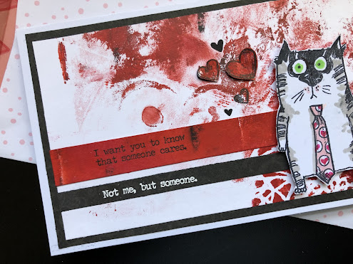
Since I am currently in my Valentine card phase I decided to limit myself in colors, which I can see yields a less interesting background. Next time I do this I'll tackle a bit more color and pattern. I used only Crimson Red, Vermillion, Titanium White, and Black. The first couple of prints I pulled were pretty boring, but this background came from a ghost print of a deeper red first try. I decided to use it anyway and see what I could do with it.


I stamped part of the sentiment from Tim Holtz with Memento "Tuxedo Black" ink onto a strip of the darker gel print (In retrospect I wish I had heat embossed this sentiment so that it would show up better against the red.). I did heat emboss the last line with white powder on a black paper strip and mounted both of these to the gel printed background. I decided to add a tie to the Tim Holtz Snarky Cat that I had previously used for my brother's birthday card and then I had fun coloring it with Copic markers and stamping tiny hearts into the white polka dots. I fussy cut him out and mounted him with dimensional foam to the face of the card, which I then mounted with a black mat to a folded slim-line card. I added several hearts, some directly to the background and some layered for dimension. 

My final bit of fun was to custom make a coordinating envelope lined with Valentine printed paper. I added a sentiment from Photoplay #S152150 "Made by Me" to the back of the envelope just below the flap.


And that's my first foray into gel printing. I look forward to seeing what everyone else comes up with!