When I saw this morning's Color Throwdown Challenge #671 - Pink, Gray, and Silver I knew I wanted to try my hand at coming up with something. The crystal chandelier caught my attention, so I started there.
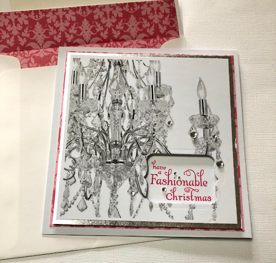
I started with a 5-1/2" x 5-1/2" white top-folded 110# card base. I went online to Lamps Plus and found a catalogue sheet for a crystal chandelier, saved it to my computer, and printed it in black and white onto a piece of the same heavy white card stock and cut it down to 5" x 5". I mounted this image to a slightly larger silver foil mat and die-cut through both layers with a Stampin' Up "Framelits - Chalk Talk" tag die. The sentiment was stamped directly onto the folded card face with PTI "Hibiscus Burst" ink before mounting a PTI "Hibiscus Burst" damask printed paper, which I had pre-cut an opening into so the sentiment would show through all of the layers. The top 2 layers (white printed stock and silver foil) were then attached to the face of the card with dimensional foam and clear gems were added. The envelope is lined with the same PTI "Hibiscus Burst" damask printed paper as used on the face of the card.
I might have stretched the challenge requirements a bit by using a black and white image (I hope this is not considered a totally digital design) to come up with the gray tones and the printed damask paper with pink and red, but I'm pleased with this very non-traditional Christmas card. My plan is to send it to one of my interior designer friends.
Here is the link to the Color Throwdown, with the inspiration photo:
Color Throwdown: Color Throwdown #671

What a fun idea to use a page from their catalog! This is a marvelous card, Fran!
ReplyDeleteWhat a beautiful card using these colors!! Thanks so much for joining us this week at the Color Throwdown!
ReplyDelete