Friday, June 25, 2021

DREAM & DISCOVER

This is my final week as Guest Designer with Just Us Girls. It's been a privilege and fun, not to mention a stretch of my skills on more than one occasion! This week's challenge is Photo Week #590 with a very interesting dream-like painting. There are so many wonderful possibilities with this photo and I'm anxious to see what everyone else did with it.

I just happen to have this Hero Arts 45th anniversary stamp set with an image of planets that in my mind was perfect for what I wanted to create. Well, to be honest, I wasn't sure what I wanted to create, just that I wanted to use this image. 


The image was clearly oval in shape so I decided to heat emboss it in dark blue on blue-gray card stock and then die cut it with a stitched oval die. I added some Prismacolor pencil to the planets and white gel pen to the stars. When I considered how I might use the sentiment (from the same stamp set), I remembered some vellum in my stash that had metallic specks in it and chose to heat emboss it onto the vellum with Stampendous embossing powder in "Penny Copper". Having done that, I thought I needed a bit of the copper embossing on the planets as well for balance. I mounted a square of blue gray textured card stock onto a square white card base and layered a white stitched oval and the blue gray oval with the planet image onto the face. I then wrapped the torn vellum sentiment around the fold of the card and bound all of the layers together with beading thread and beads. My cellphone photo just could not do justice to the copper tones on this card.

Again, I want to express my appreciation to the Design Team at Just Us Girls for letting me play with them for the month!


HAPPY 4TH OF JULY

I just finished my 4th of July cards and have them all ready to send out starting tomorrow. I made an edition of 27 this year and used the same design that I created here for Freshly Made Sketches #482. But in the interest of ease, and so it wouldn't cost so much to mail, I decided to simplify the card by eliminating the dimensional foam.


I usually sign and date the back of all of my cards. I've been tossing around the idea of having a custom stamp made with my blog address but haven't done that yet. If anyone knows of a good source, please pass it on! In the meantime I usually stamp a small image that relates to the season and sign and date. this one is a tiny little cupcake that I've had for years that I stamped in PTI's "Blueberry Skies" and colored in the red stripes with a felt-tip pen.


We're going into this weekend with record-breaking temperatures - it's supposed to get up to 112 on Sunday! COVID-wise, here in Oregon things seem to be finally getting back to normal. The governor is lifting all of the old restrictions when Oregon reaches 70% vaccination levels or June 30th, whichever comes sooner. This is really good news for my son who owns a restaurant. He's been struggling with trying to cope with a 50% occupancy ruling. During the periods when his restaurant had to close he used the time to study and take the real estate test so he is now licensed as a realtor if he has to have a fallback position. 

Well, I hope everyone stays cool this weekend!

Saturday, June 19, 2021

JUST US GIRLS - COLOR WEEK #589

The week from hell! The week started with preparations for a large interior design concept presentation on Tuesday afternoon and then all of the follow-up correspondence and ordering of new finish samples. It's also Hal's last week of school AND his car decided to crap out, so I was shuttling him back and forth to work. Enough complaints about my first world problems!

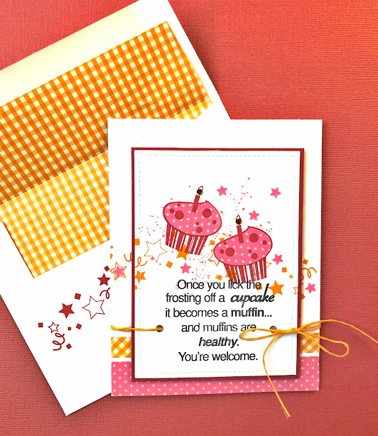
This is color week at Just Us Girls and it's being brought to you by the colors Orange, Poppy Red, and Hot Pink - three very festive colors - so I decided to do a birthday card. While rifling through my stash of older rubber stamps I can across this sentiment from Riley & Company "Funny Bones" #RWD-187.


I started by stamping two cupcakes from a VERY old birthday stamp set with PTI's "Pure Poppy" on a pre-cut stitched rectangle of white card stock. I also stamped it onto some PTI "Hibiscus Burst" small dotted paper and fussy-cut the frosting to glue onto the cupcakes. I then stamped the confetti image in PTI's "Orange Zest" on both the rectangle and the folded card stock and added a Tim Holtz splatter in Hibiscus Burst. I stamped the sentiment in Memento's "Tuxedo Black" and mounted the rectangle to a poppy-colored mat. I added scraps of printed hot pink and orange strips along the bottom, punched holes in the rectangle, threaded orange twine through the holes, and mounted all of this onto the card base with dimensional foam. I finished by tying a bow with the twine and attaching some hot pick punched stars and a couple of orange gems for the candle flames (which show up as black in this photo).  

So I'm hoping you'll all enjoy this challenge and will take a try at it!


Friday, June 18, 2021

SENDING SUNSHINE

Addicted to CAS #200, hosted by Sue, is "Sun" - very appropriate for a sunny day! Unfortunately large swaths of the US are suffering under record-breaking heat. One of my close friends in Las Vegas reports that she's expecting it to be 115 F by 5:00 today. Those of you on the metric system can do the math - it's significantly higher than 30 C, which I always think of as the level where the temperature starts to become unpleasant. 

Every once-in-a-while a card comes so easily that I think there's something wrong. This is one of those times, but rather than second-guess myself I'm just going to put it out there. I thought to combine two challenges - Addicted to CAS and Freshly Made Sketches. I really don't have a stamp with a sun so I made due by using what I think is supposed to be a sort of Renaissance style compass rose from a new to me set - Hero Arts #CM357 from their 45th Anniversary set with throwback images from 1974. I stamped the sun in PTI "Orange Zest" onto a light yellow cardstock, colored it with alcohol markers, and then fussy-cut it to eliminate all of the stars between the sun rays that are on the original image. 


I cut a panel of blue paper and stamped the clouds from Hero Arts Color Layering with Hero Arts "Unicorn" pigment ink and Ranger "Stormy Sky" distress ink. I matted the panel with navy card stock and attached it to a folded white card. The sentiment is from PTI's "Doodle Doo" stamp set that I heat embossed in white on navy blue. I glued it and the sun to the card and applied yellow enamel dots. All done!

Be sure to check out what the other designers have created and have a go at it yourself!


I'm also entering this into the Freshly Made Sketches #490:


Friday, June 11, 2021

JUST US GIRLS - TREND WEEK

WHEW! This week's Just Us Girls Challenge is for a card with NO stamping! I didn't realize how much I use stamps to set the message of my cards until this challenge. I did a very deep dive into my stash to see what I could find that could be used for a card, and although I have a number of word dies, I decided not to use any of them and instead go with a quote sentiment from an old Graphic 45 "Kraft Reflections Collection" as the basis of my card.


I started with an ivory watercolor paper that I blind embossed a rectangular die on and attached it to one of the print papers from the Graphic 45 as a mat and added one of the quotes. I selected one of the sillier cut-out figures from Tim Holtz "Idea-ology Group Paper Dolls" and mounted her to the face with dimensional foam. Then I die cut some tiny ivory hearts and glued one to her shirt and three at the end of the quote. This was then all mounted onto a dark brown 6"x 6" folded card base. That's just about as simple as it gets, but I think it took me hours to make this card!

The process of making a CAS card always seems to take me more time than one that is less simple, because I put all of the elements together and then start editing. How much can I take away from the design but still maintain the purity of the idea?

These are the instructions for this week's challenge and I challenge you to try it!


"Just Us Girls" Challenge: Just Us Girls Challenge #588 - Trend Week


TIME TO UNPLUG

This will probably be the last card from me for a couple of days as I'm working toward a design presentation early next week for the project I agreed to take on (in my retirement). Also, this morning I'm avoiding what I "should" be doing, which is cleaning house because we're having a small group of guests over for dinner tonight - for the first time in more than a year!

Having said all of that, this card is a message to myself about expectations - a reminder to relax them a bit. Everything will get done. I'm submitting it to the Color Throwdown #646 - Light Gray, Aqua, and Navy. 


I've been playing with a couple of new layering stamp sets from Hero Arts. The clouds and palm trees are from #CM317 and the waves are #CM316. The sentiment is from Simple Stories "Great Escape". The inks I used were PTI "Aqua Mist" and "Enchanted Evening" and Hero Arts Pigment Ink "Unicorn" and Memento dye ink "London Fog". I blended a bit of PTI "Blueberry Sky" onto aqua cardstock before stamping the layered clouds and palm trees and then mounted it behind a couple of die cut circles. (The stitched circle is cut into the pre-stamped top layer of the card and the second circle outline was cut from white card stock and mounted onto the face of the card.) All of this was mounted onto a white top-folded card base and some small clear gems were added for shine. I lined a white A2 envelope with a scrap of printed light-weight paper.   


Now it's time to get busy, but I will be reminding myself to relax a bit and enjoy the day as it progresses toward a fun evening of lively conversation and good food and drink!   

Saturday, June 5, 2021

THANKS FOR YOUR KINDNESS

I'm really pleased to announce that I've been invited by the ladies at Just Us Girls Challenge to participate as Designer for the Month of June! 

This first challenge of the month is Word Week #587 - Kind/Kindness. I have to admit to having some difficulty getting started and had a couple of false starts, but I finally settled on a thank you card that could be masculine or feminine - and in my favorite CAS style.


I started by inking some light green dots onto a white card base, then gluing 2 die cut white flower branches (Tim Holtz #661808) directly on the card and overlapping a die-cut tag (Stampin' Up "Framelits - Chalk Talk") on which I had stamped the sentiment from two different stamp sets (PTI "Embroidered Blooms" and Hero Arts DC152) in Memento "Tuxedo" and Stampendous white embossing powder respectively. I attached a third flower to the face of the tag after smudging a tiny bit of green ink on it. Then because I can never pass up the opportunity to hang some twine off my cards, I tied a short length of black and white baker's twine through a hole I punched in the tag.

"Just Us Girls" Challenge: Just Us Girls #587 - Word Week (justusgirlschallenge.blogspot.com) 


Well, despite the fact that June is a very busy family month of birthdays and barbeques, I am looking forward to filling out the month with the JUG challenges. Although I am "officially" retired I agreed to do one last interior design project for one of my favorite builders and it's a large medical research facility, which will probably seriously cut into my free time for the next several months. Oh well, I'm accustomed to keeping several balls in the air at once! 


ADDICTED TO CAS - BEACH

It's time for a new challenge here at Addicted to CAS! Today's code word is brought to us by the "Simply Beautiful" Ceal. It's a great opportunity to get out all of those new summer "beachy" stamps and dies you've been stocking up on!  

I have to admit that I really didn't have anything in my stash, so I went shopping and picked up a couple of new Hero Arts Color Layering stamps. I haven't done much in the way of color layering but these Hero Arts CM316 and CM317 were great fun - so many images to choose from.


I decided to combine the beach layering image with a fun Tim Holtz die set that I've had for about a year but haven't really used. It's "Happy Hour" #664435. Now that I've officially broken it in, I can see that I'll be using it much more in the future.

I started with some blending of sky and sand and layered PTI die inks "Spring Rain", "Aqua Mist", and "Ocean Tides" (appropriately-named!) for the background image and then got the idea of repeating the same within the cocktail glass, so I stamped it twice so I could use it for the inside of the glass. I die-cut the glass from glossy photo paper and layered on all of the die-cut accessories included in the set, using some Ranger "Glossy Accents" on the ice cubes. I mounted the background scene to a 5-1/2" square card base and die cut an opening from an old die and stamped the sentiment with PTI's "Ocean Tides". Once all of the components were completed the final layering turned into an engineering challenge getting everything lined up properly.  


As I write this it's a long Memorial Day weekend here in the US and we're all thinking about summer vacation. With the pandemic appearing to have peaked here, restrictions have been eased a bit - here's hoping people don't get too careless so that we can continue to enjoy some freedoms away from face coverings.