Sunday, August 29, 2021

THE BEGINNING OF "BIRTHDAY SEASON"

In our family the month of September is our "Birthday Season". It starts off on the 9th with the grandtwins' big day, followed by Hal's on the 17th, mine on the 25th, and our son's wedding anniversary on the 29th. In between those days are various other family/friends' birthdays, which makes the whole month very celebratory.

It's hard to believe that those two twin-souls (Alexis and Colin) will be 12 soon! They were born on 9/09/09, which has always felt rather auspicious. They have just finished their first week of middle school. They go to the same school where Hal teaches so, while he teaches in the high school and they are in the middle school, he sees them on campus nearly every day and always gets hugs. Not a bad thing in the course of one's day!


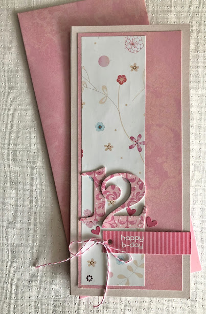
Today I set out to make a birthday card for Alexis, jumping off from the latest Freshly Made Sketches #500. I decided to try the sketch out as a slimline card and chose to use 4 different patterned papers from my scrap bin. My granddaughter has always loved to mix patterns in her clothing so this seemed appropriate for her. I used the same number dies by PTI for this card as the one I made for her brother, which you can see here. After gluing the patterned elongated rectangles onto a pale pink folded card, I wrapped a strip of striped paper on which I had white heat embossed the sentiment around to the other side so I can insert a gift card there. I had punched holes all of the way through the layers and tied the strip on with some pink and white bakers twine and glued on three die-cut hearts. 

I'm sending this over to Freshly Made Sketches #500.

Freshly Made Sketches: Freshly Made Sketches #500 - A Decade of Sketch Inspiration


Saturday, August 28, 2021

ADDICTED TO CAS #205 - NATURE

For our new two-week challenge Toni has selected "Nature" as the code word, giving us a large field of ideas to maneuver within! 

I've been thinking about my brother recently, and while it's easiest to just pick up the phone, I sometimes prefer to surprise the people I love with a card and personal note. He and most of his family live in West Virginia so we don't see each other very often - especially with the whole COVID thing. We lost our middle brother rather suddenly just a little less than a year ago so it seems particularly important to stay in touch. Given his love of the outdoors and all of nature I selected images that I thought he would respond to.


I find these tones of gray and gray-green to be very soothing and befitting Bill's calm mind and soul. I used Hero Arts CM316 "Color Layering Waves" and CM317 "Color Layering Sea & Sky for all of the images, stamping them in PTI "Soft Stone", "Smokey Shadow", and "Ocean Tides" and Memento "London Fog". I took a white Prismacolor pencil to the dolphin's tale to make it look submerged in the water and added a sentiment from HA+Gina K #PR101. Once that was completed I wanted to highlight the main images and sentiment a bit more so I die-cut them from one of my Lawn Fawn stitched rectangles and popped it out with some dimensional foam and adhered it to a PTI "Ocean Tides" cardstock for the base.


This close-up shows the sequins and dots I attached last. This card was a bit larger than normal so I had to make a custom envelope for it by adjusting one of my Anna Griffin envelope templates.

Well, given Toni's generous choice for a subject matter, there are lots of ideas for all of you to explore. Have fun, but keep it clean and simple! 

Addicted to CAS: Challenge #205 - Nature


Sunday, August 22, 2021

TRICK OR TREAT

It's too smoky outside to work in the garden, so here I am this Sunday afternoon thinking about making Halloween cards. The current AAA Cards CAS Challenge #197 is "One Inch Strip + Optional Coloured Cardstock". This was so much fun that I might do some more with 1" strips since I have quite a few Halloween stamps that will fit within that format.


Onto a gray cardstock I stamped the haunted house from Stampers Anonymous Tim Holtz "Haunted House" CMS308 with Memento Tuxedo Black then heat embossed the sentiment from Simple Stories "Boo Crew" #13820 with Zing! "Apricot embossing powder. The bats from one of  Tim Holtz's Halloween collections were heat embossed with black, although the shininess of the heat embossing doesn't show up in my photo. I finished it off by punching the end with a blood drip and inserting an orange punched piece, gluing the strip to a black textured cardstock. I think if I were to do this again I would stamp the house in a dark gray so that the bats would show up a bit more. The custom envelope is cut from some orange stock I had on-hand and lined with some lightweight skull paper. 

This layout has some promise as a preliminary thought about my personal Halloween cards. We'll see if I develop it further.


AAA Cards: Game #197 - One Inch Strip + optional twist Coloured Cardbase


Added on September 13, 2021:


Be sure to return on October 31st for my Guest Designer shot!

Saturday, August 14, 2021

SHADES OF BLUE

We've been pretty much in and out for the past couple of weeks so I've been sneaking a couple of minutes of crafting time here and there. I did this card in response to Less is More's Colour Challenge #449 - "Shades of Blue" before leaving for a day-trip to the Oregon coast.


This little 1-3/4" x 1-1/4" nighttime sailing ship is from Hero Arts CM357, as is the compass rose (I've used it previously for a sun by cutting off the stars). I heat embossed navy embossing powder directly onto the face of a folded card and colored it with about 4 blue Copic markers and touched it up with a bit of white gel pen. I then cut out a rectangular mat of white cardstock and layered over that and glued a 3rd layer over that of a slightly smaller panel that I had pre-stamped with the compass rose in Memento "Summer Sky" and the sentiment (Simple Stories "Great Escape") in PTI's "Enchanted Evening". I finished it off with some denim blue scrap paper to line the envelope.


 This close-up shows the plate marks from my rectangular dies.


"Less is More": Challenge #449 - Shades Of Blue (simplylessismoore.blogspot.com)


FISHY LEFTOVERS

The week before last I drove up to Longview, Washington (the place of my birth) and picked up a cousin who lives alone and doesn't get out much and brought her back here to southern Oregon for a week. Then last weekend hubby and I drove her back to Longview and stopped off in Portland on our way home, where an old friend hosted us in her home. She fixed the most incredible baked steelhead for our dinner and I wanted to send a special thank you to her and her family. I had this leftover fish that I had decided not to use on my Addicted to CAS "Fishy" card and it's been sitting here on my craft table for a week. Then I saw this week's Freshly Made Sketches #498 by Jen T. and decided that with a couple of oval dies for a platter it could make the perfect thank you card!


I started by die-cutting a Pink Fresh Stitched Rectangle and then die-cutting an oval opening in the center of it and mounting that to a cardstock base. Then I layered 2 more ovals over that opening, finishing with the largest oval with a decorative edge. I die-cut a couple of branches from Penny Black's "Airy" 51-423 in green lightweight scraps, glued them to the platter and laid the fish that I had fussy-cut last week onto the greens with some dimensional foam. The fussy-cut spoon is from PTI's "Tea for Two Additions", and the lemon wedges are Tim Holtz "Happy Hour Cocktails" dies. The sentiment is a random stamp that I heat-embossed in white onto a mauve scrap.

What to do with leftover fish!

Freshly Made Sketches: Freshly Made Sketches #498 - A Sketch by Jen T 


Added August 17, 2021


ADDICTED TO CAS #204 - FISHY

Jaydee selected "Fishy" for our code for the next two weeks at our Addicted to CAS challenge.

I honestly didn't think I would be able to come up with a "fishy" card for Jaydee's chosen code word without a trip to the craft store to search out fish stamps. But then I remembered that I had at one point purchased a couple of wooden stamps for birthday invitations for a 4-year-old daughter of one of my son's friends. That little 4-year-old is now 20, so that tells you how old this stamp is! It must have been one of the first stamps I owned and other than the invitations, I don't remember ever using it anywhere else. I had thrown it into a bin of old stamps and ink pads for the grandkids. The wooden block says Postmodern Design #RE3-106-C "Funny Fish". I have a habit these days of peeling the old rubber images off of the wooden blocks and using them with my MISTI or Tonic stamp platforms.


The first thing I did with this fish image was to stamp it twice with a very pale warm gray ink. Then, using "Laurel Leaves" rubber stamps from IndigoBlu (because I thought it looked more like seaweed than any other of my leaf stamps), I layered them over the fish with PTI "New Leaf" and "Pinefeather" inks. Then I colored the fish with Copic markers and white gel pen and stamped the sentiment from Hero Arts #CM316 "Color Layering Waves" with PTI "Pinefeather". I had cut the cardstock just slightly smaller than the 4 1/4" x 5 1/2" folded card so I attached it with dimensional foam.

Sometimes I completely surprise myself with what paper scraps I find in my heaps of paper, and I loved that I was able to line the grape-colored envelope with this river rock printed paper!

Now over to you so you can amaze yourselves with your clever ideas - can't wait to see what everyone comes up with for this theme! Just remember to keep it clean & simple.


Wednesday, August 11, 2021

FANGTASTIC F WORDS

While wandering through card challenge-land I discovered a new (for me) challenge called The Sisterhood of the Snarky Stampers. Wow! Where have you guys been all my life? This challenge has my name all over it and the current Challenge #191 is "F is for F Words" and since Fran is an F word...

I don't have any "naughty" F word stamps or supplies but as I LOVE making Halloween cards, I opted for this Count Dracula (Stamp Francisco) and the sentiment from Impression Obsession (#CL366 "When Life").


On a a 5"x 5" folded card base I stamped the corner cobweb (Tim Holtz) with Memento "Tuxedo Black" ink and then stamped it twice more with white embossing powder on black and black ink on the lavender scrap. I black embossed the count on white stock, colored his skin with "Wax White" Copic marker, added some blood to his fangs, and fussy-cut him out. The sentiment was white embossed on red-orange card stock and die cut with a Stampin' Up "Framelits Chalk Talk" tag. I cut down a matching red-orange envelope to make it square and lined it with some cobweb paper from my Halloween stash. The blood spatters on the tag and envelope are from a very old stamp set and I used VersaMark watermark ink to get the red stains. And finally, I tied the tag off with some black and lavender baker's twine.

I'm looking forward to some further participation with these snarky ladies!


Saturday, July 31, 2021

ADDICTED TO CAS #203 - RAIN

Raga has chosen "Rain" for our next challenge here at Addicted to CAS, and boy do I wish that could be a weather forecast here in southern Oregon as our drought continues and the wildfires burn. 

I met all of my professional design deadlines at the end of last week so I have a bit of a respite for some cardmaking. This is my entry for "Rain".  


I used a Strathmore watercolor card base and matching envelope for this card, first stenciling the background Tim Holtz "Dot Fade" with Memento "London Fog" dye ink. On a separate piece of white textured cardstock I stamped the small Rain or Shine image from Hot Off the Press, Inc. in black ink. I've used this image on several cards over the past 5 or so years. I die cut the stamp frame and colored and blended the sun and clouds. I heat embossed the sentiment on dark gray cardstock, cut it out, and attached it to the postage stamp die. Finally, I attached the postage stamp to the card base with dimensional foam and stuck on 3 yellow enamel dots from my stash.

I hope you all will have as much fun on your rain challenge as I did! And check out what the other designers have come up with.


Addicted to CAS: Challenge #203 - Rain


Wednesday, July 28, 2021

TRIP AROUND THE SUN

When I saw Seize The Birthday #219 - "Travel" I wanted to participate, but couldn't come up with an idea. I really don't have any travel-related stamps or dies to speak of - other than one stamp set that's based on exploration, and I didn't think it would really work. But then I remembered this PTI sentiment from years ago and I thought I could use it. Wouldn't a 365-day trip around the sun count as travel?


The sentiment is from PTI's "Stylish Sentiments: Birthday". This stamp set has been in my collection for quite a few years and I've used it again and again because of the variety of sentiments in the set. I had to do some masking to open up the sentiment so that I could do a reverse strip through it. I won't tell you that wasn't tedious! After printing the black ink and adding the white heat-embossed strip I cut a circle die and used it for the sun background. I used a new blending brush I just purchased and I have to say I need some more experience with these to get an even blend! I stamped a sun image from Hero Arts #CM357 "Dream & Discover" in PTI "Orange Zest" dye ink, colored it with Tombow ABT Pro alcohol-based pens, fussy-cut it out, and mounted it over the blended circle with dimensional foam. Finally, I punched a hole in the black band and tied a small piece of ribbon from my stash and mounted all of this onto a white card base. I lined a white envelope with a scrap of paper from my "yellow" paper stash. 

And off to the Seize the Birthday challenge!


 Seize the Birthday: Seize the Birthday #219-Travel


Sunday, July 18, 2021

FIRST HALLOWEEN CARD

Yup, I start thinking about Halloween cards this early in the year because they're honestly my favorite cards to create. So, as soon as I send out my 4th of July cards I start looking for ideas and challenges to get my ghoul on!

Today I was inspired by Freshly Made Sketches #494 as my jumping-off point.


Using a piece of mottled gray paper from my stash, I masked off a vertical rectangle and stamped some KaiserCraft "Fading Dots" with Memento "Tuxedo Black" dye ink. Then I added the sentiment from Simple Stories #13820 "Boo Crew" and heat embossed it with Zing! "Apricot". I attached the top die-cut ghost and re-stamped and embossed over it so that the sentiment overlapped the image. The second Tim Holtz ghost went on and all of this was attached to a black folded card base. BTW, these are my favorite ghosts and and I find myself using them over and over.

Freshly Made Sketches: Freshly Made Sketches #494 - A Sketch by Narelle


Saturday, July 17, 2021

ADDICTED TO CAS "GEOMETRIC"

It's time for a new Addicted to CAS challenge! The very talented Vicki is our host this week and she has chosen "Geometric" for us to play with.

I've been away from my craft desk and supplies for a couple of weeks and it feels good to be jumping back into the fun. It's stacking up to be a much busier summer than I had anticipated and I find that when I can steal a couple of moments for myself I prefer to take a nap!

For this challenge I chose to make a birthday card for my grandson for his 12th birthday in early September. (I'll use another challenge sometime soon to encourage me to make his twin sister's card.)

I landed on squares, rectangles, and a circle for my geometric shapes. It was pure happenstance that this red and white striped paper lined up perfectly with some black and white checkered paper in my stash. I just glued the checkers and stripes to the bottom of a 5-1/2" x 5-1/2" folded white card and stamped the sentiment from PTI's "Doodle Do" in Memento "Tuxedo Black" dye ink. I cut out a circle of black cardstock and die cut the numbers from PTI and layered them on. Done!

It's now your turn - just remember to keep your card clean and simple and let all of the designers know if you like their designs.


Addicted to CAS: Challenge #202 - Geometric


Saturday, July 3, 2021

CHRISTMAS IN JULY

The new Addicted to CAS challenge is #201 "Christmas", hosted by Nancy. Under other circumstances I would welcome a change of pace and the first Christmas card of the year, but can you imagine how difficult it is to be creating a Christmas card when the temperature is a record-breaking 115 degrees F? It's even hotter than that north of here in Portland.


I used some old PTI images for the stamping on this card. The bow is inked with PTI "Ripe Avocado" with their "Ribbon and Bows" stamp set. For the sentiment I used their "Season's Greetings" and gold heat embossed most of it, but used "Pure Poppy" ink on the last line. I added a little image from Impression Obsession's "Holiday Words" #CL971, fussy-cutting the berries from a scrap of red card stock. When all of the inking was completed I ran the card through my Big Shot with a square die to make a blind embossed box. I had cut this card into a 5" square of Strathmore watercolor paper card sets. To get an envelope that fit, I disassembled one of the matching Strathmore envelopes, cut it to size, reassembled it, and lined it with lightweight red iridescent vellum.

Well, have some fun with Nancy's "Christmas" theme. And for any of you here in the Pacific Northwest, do stay cool and safe!  

Addicted to CAS: Challenge #201 - Christmas


Friday, June 25, 2021

DREAM & DISCOVER

This is my final week as Guest Designer with Just Us Girls. It's been a privilege and fun, not to mention a stretch of my skills on more than one occasion! This week's challenge is Photo Week #590 with a very interesting dream-like painting. There are so many wonderful possibilities with this photo and I'm anxious to see what everyone else did with it.

I just happen to have this Hero Arts 45th anniversary stamp set with an image of planets that in my mind was perfect for what I wanted to create. Well, to be honest, I wasn't sure what I wanted to create, just that I wanted to use this image. 


The image was clearly oval in shape so I decided to heat emboss it in dark blue on blue-gray card stock and then die cut it with a stitched oval die. I added some Prismacolor pencil to the planets and white gel pen to the stars. When I considered how I might use the sentiment (from the same stamp set), I remembered some vellum in my stash that had metallic specks in it and chose to heat emboss it onto the vellum with Stampendous embossing powder in "Penny Copper". Having done that, I thought I needed a bit of the copper embossing on the planets as well for balance. I mounted a square of blue gray textured card stock onto a square white card base and layered a white stitched oval and the blue gray oval with the planet image onto the face. I then wrapped the torn vellum sentiment around the fold of the card and bound all of the layers together with beading thread and beads. My cellphone photo just could not do justice to the copper tones on this card.

Again, I want to express my appreciation to the Design Team at Just Us Girls for letting me play with them for the month!