Saturday, April 24, 2021

STARS & STRIPES

It probably seems silly to be thinking about my 4th of July cards already, but when I saw Karren's CAS sketch for Freshly Made Sketches #482 it looked like the perfect opportunity to utilize this layout for stars and stripes. Plus, starting my cards this soon means I won't end up in a crunch at the last minute. While I made the custom envelope for this initial card, I'll probably purchase blue or white #10 envelopes and line them with red stripes.


This card was made by first cutting and mounting a strip of red and white striped printed paper from my stash and stamping the sentiment from PTI's "Red, White & Blue" set with their "Enchanted Evening" dye ink. Then the only thing left was to overlap the stars die (don't remember whose it is), cut it out from the face, and layer it for dimension. Then this was all mounted to a folded slim-line card, slipping a small piece of blue cardstock underneath the open star - very easy and CAS. 


We're looking forward to a moderately normal July 4th celebration this year, since all of our extended family members (except the children) have now been vaccinated. My son and his family usually take their annual vacation around the 4th of July and they always reserve a cabin, a year in advance, at one of  our local lakes. We all gather on that day and stay for the evening fireworks display put on by the lake resort. 

Freshly Made Sketches: Freshly Made Sketches #482 - A Sketch by Karren


Added April 27, 2021:


ADDICTED TO CAS #196 - SKY

The current Addicted to CAS challenge #196 is up now. This is a fun choice of code word by our hostess Vicky! "Sky" opens up all kinds of opportunities for creative expression. I don't have a specific use yet for this card, but I'm sure I'll find one.


About a month ago, while browsing one of my favorite shops, I came across this whole Simple Stories collection of stamp and papers - Simple Vintage Great Escape - that I couldn't resist. I started with cutting a curve stencil and blending the bottom of a white card that I had already die-cut with the stitched cloud die (I think Lawn Fawn) with PTI dye inks "Pinefeather" and ""New Leaf". Then I added a line of stitches from Bo Bunny's "Stitches" stamp because I thought it looked like a fence or trail. The Simple Stories "Great Escape" stamp set came with a small row of 5 tree silhouettes that I repeated across the bottom in the same PTI inks. I added the sentiment in Pinefeather and the birds in black. I layered this piece with another cloud and mounted both pieces onto a backing that had been color blended in PTI "Spring Rain" ink and trimmed each side slightly to mount onto a card base.

The envelope is lined with one of the papers from the collection.

I'm sure you will all find lots of beautiful and creative ways to use Vicky's code word! Have at it!!


Tuesday, April 20, 2021

DIAMONDS ARE A DOG'S BEST FRIEND

Oh, please forgive the terrible pun! Today's card is in response to Less is More Challenge #441 -  One Layer, "Diamonds". The card has to be only one later, and absolutely no embellishments.


Currently I've been challenging myself to dive deeply into my stash and use old stamps and materials. And this card is a very deep dive! I have a number of very old clear stamps in my stash that I probably picked up in clearance bins for $1.00. The larger green Argyle pattern used for the background is from a very small set that also included the sentiment. The scotty is from an old dog set and it was a huge surprise to see that the same diamond/Argyle pattern appears on his coat in miniature. I hadn't started out making a Father's Day card, but why not?  

I started this card by stamping the sentiment and scotty together, masking off the tiny collar. Then I made a mask of  the dog and stamped the diamond pattern twice in PTI's "New Leaf" dye ink and added little black dots with one of my drawing pens. I then masked off the entire card and stamped the little red collar. I put a metallic gold medallion on the collar by inking just the medallion with a VersaMarker water mark pen and heat embossing it with gold powder. The final step was to blind emboss a rectangular stitched die to give the card some dimension. The manufactured A2 envelope is lined with some 20 lb bond stamped repeatedly with the little 3-diamond Argyle element.


Monday, April 19, 2021

HELLO

Combining two challenges today with this card - CASology #388 "Hello" and AAA Cards CAS Game #188 "One Inch Strip + Optional Small Stamps".  And I had so much fun with this combination! 


I started with a kraft A2 card base by masking off 1" with washi tape and stamping an overall rose pattern in PTI "Smokey Shadow" within the 1" strip. Then I got out my Copic markers and started having fun coloring. I used YR24 Pale Sepia for the rose centers, W4 Warm Gray 4 on the leaves and stems, and filled in the background with W8 Warm Gray 8. I used a white Prismacolor pencil for the highlights on the petals and came back in with white gel pen for the dots in the centers of the flowers. When this was all completed I overprinted a PTI sentiment with white heat embossing. 


I went searching in my stash for a black A2 envelope but didn't find one so I made one and lined it with 20 lb white bond stamped with the rose stamp and PTI's "Smokey Shadow" die ink and filled in the rose centers with my Copic marker. I have this thing about wanting to always match an envelope to my cards - if I'm going to go to the trouble to make a handmade card, well why not carry it to the next step? Am I revealing my OCD tendencies?

Sending this on to:

CASology: Week 388: HELLO


Added May 9, 2021:


POPPY POST

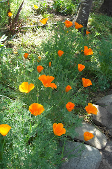
 I think poppies are my favorite spring flower - especially California poppies, which I have growing all over my garden. I just let them reseed from year to year and they show up in areas that are always a surprise. I love their cheerful faces that close up at night and reopen with the morning sun. So, why don't I have any poppy stamp sets? I'll have to see to that!


So I improvised with a W+9 Studio "Botanical Bunch" stamp set. I die cut each of the stamp dies from white card stock and removed the rectangular centers and replaced them with Copic-colored centers and mounted them to a card face that was slightly smaller than 4-1/4" x 5-1/2". I white embossed the sentiment (PTI "Friends til the End") on black stock and mounted below the 3 stamp images. I then mounted this with some foam dimensional tape to the folded card base.


This "Pretty Poppy Post" paper magically showed up in my stash box! I think I had been waiting for years for a use for this paper, and I don't think it gets any better than this. I lined a white A2 envelope with it and stamped the sentiment on the back of the envelope from my new favorite stamp set - PhotoPlay SIS2150 "Made By Me".

I made this card specifically to enter in the current challenge at Fusion Card Challenge - "Poppies":


Fusion Card Challenge: FUSION - Poppies


Poppies in my garden a couple of years ago:


Sunday, April 18, 2021

SUNSHINE, WINE, AND CARDS

 What an incredible weekend it's been! Yesterday was sunny, almost 80 degrees, and slightly breezy. Early in the evening we had a couple of guests over originally for wine and cheese on our patio, and as the conversation kept going Hal made pizzas and they stayed on for dinner. It was a beautiful evening.

Earlier in the day, before going out and working to get the patio into shape for company, I made a card inspired by two different card challenges - Freshly Made Sketches #481 and Color Throwdown #638. It's always fun to combine challenges because it makes them that much more challenging.


 All three of these images are from a very ancient stamp set - it must have been the first clear stamp set I ever purchased and I have no idea whose it is. I stamped each of the images three times with PTI "Enchanted Evening" dye ink. I used my Copics to color each of the images alternating between blue, yellow, and green. My yellow Copic was a bit of a struggle as it's running out of ink. I then heat embossed "Happy" in navy and cut "Birthday" from a PTI die and layered it. I layered the front with yellow and navy mats and mounted on a white card base. Three blue sequins from my stash finished it off.

The die-cut birthday sentiment is pretty subtle and doesn't show well in photos. Here's a close-up:


It promises to be another beautiful day - you're welcome to join me this afternoon for a glass of wine on our patio. Pouring when it's 5:00 somewhere in the world!                     


Thursday, April 15, 2021

KITCHEN PROJECT


I've been planning for some time to share photos of our kitchen renovation that was finally completed this winter. We didn't have the funds to do a complete remodel so kept it modest by maintaining the same footprint, while opening it up to the dining room. The dining room was the original living/dining room of our 1956 ranch-style home. Sometime during the 60s the house was expanded by adding a large living room and new garage, leaving the old living room functioning as a family room. The kitchen was never expanded and when we moved in to the house with our teenage son in 1986 the kitchen was tiny, dark, and highly inefficient. The kitchen had been updated sometime in the 70s, as indicated by the harvest gold appliances. The washer and dryer location was also in the kitchen and cut back even more on usable space. The 70s changes were so poorly done that in order to open and load the dishwasher we had to first open the oven door for clearance. This kitchen needed SO MUCH WORK! Over the years it has been a work in progress, adding improvements as we could afford them. Last year before the beginning of the renovation the room looked like this:

This was actually a major improvement from when we first moved it. Over the years we removed an overhead cabinet that hung over the breakfast bar, replaced a solid wood door to the patio area with a French door, replaced the old vinyl floor, enlarged the window over the sink, put in a skylight, and had pantry cabinets built along one whole side of the kitchen. The plastic laminate countertops were chipped and split at the seams so we started by planning to replace the countertops with quartz. So, if we replace the countertops shouldn't we also replace the sink and cooktop, and how much would it cost to remove the old breakfast bar and have all of the doors and drawers replaced, and what about widening the opening to the dining room? That's how it all started. 

To shorten this whole story, here we are now:


New quartz countertops, cooktop, sink, tile backsplash, vent hood, overhead cabinets, and wider opening into the dining room. We didn't want to go to the expense of all new cabinets so the cabinet shop installed new face frames, doors, and drawers in the lower existing cabinets and built two new overhead cabinets. We chose to have these painted instead of stained, but brought the wood over to the bar top and open shelves on the dining room side to pull it all together.


So, it's not my dream kitchen but it is so much more efficient - and we finally have enough storage for everything. While the kitchen is still minute, it now feels very open. 

Monday, April 12, 2021

DAY 7!!

And the final day of my personal challenge to create a card every day for a week! I've never tried this before and it is a bit intense, so I'll be taking a couple of days off to get my creative space back into its original upright position. 

Yesterday was a great day spent with old friends that I haven't seen for more than a year - what a welcome change! We have all had our COVID vaccines so we'll be getting together again soon.

Freshly renewed after a relaxing Sunday and a normal night's sleep (our beloved lab Sara is really failing right now and not allowing us much sleep - we have our good days and we have our bad days but last night she slept through the night), I decided to go with the latest Just Us Girls challenge for inspiration. This one - Trend Week #579, "Use more than 1 stencil" - was quite challenging since I have done very little stenciling and have only a couple of stencils.


I had this idea to do a tagged sentiment that is integral with the card rather than just making a printed tag and mounting it on the card. It was probably a case of going around the block to get to the other side of the street, because it turned into a very complex puzzle to solve. For the flower stencil I used a Tim Holtz mini stencil (Set 10). The stencil actually has 3 flower stems on it so I had to mask off the other 2 and then did additional masking to make the roses 2 tones of pink and the stems and leaves 2  tones of green. After that I stenciled Tim Holtz "Dot Fade" #TH5006 with Hero Arts Shadow Ink "Butter Bar". Then I die cut the larger tag (Stampin' Up "Framelits Chalk Talk") from the face of the card and trimmed off 3/4" on the left side. The smaller black sentiment is a smaller tag mounted to the face of the card and then the larger tag/frame was cut for multiple layers so it would be raised from the card face. This puzzle I set for myself was quite a pain in the butt! I won't be trying that again any time soon.

But I'm now finished with my 7-day personal challenge - HA! if only I had the same discipline with my weight!

"Just Us Girls" Challenge: Just Us Girls Challenge #579 - Trend Week


Sunday, April 11, 2021

DAY 6 - TWO QUARTERS + RAINBOW

This morning I decided to tackle the current AAA CAS Cards Game #187 - Two Quarters + optional rainbow. Whew - they know how to complicate things over at AAA Cards Challenge while requiring lots of white space! My card today has maximum white space while keeping the color and sentiment to the left half of the card.


I stamped the sentiment in Memento's "Tuxedo Black" ink with PTI's "Beautiful Butterflies". After stamping I passed the card stock through a Darice embossing folder to suggest rain. Then I cut the stock into quarters and mounted them to a plain white backer and black mat. The butterflies are die cut individually in rainbow colors using an old butterfly edge die that I'm not sure I've ever used.


A little later we're heading over to see a small group of friends and to watch the finals of The Masters golf tournament. We're all now safely vaccinated and while Hal sees these people daily (colleagues of his), I haven't seen any of them for over a year. I'm not a big golf fan but I'm really looking forward to a bit of social contact.

I'll be back tomorrow with my 7th day of cards!


AAA Cards: Game #187 - Two Quarters + optional twist Rainbows


Saturday, April 10, 2021

DAY 5 OF MY PERSONAL CHALLENGE

I'm now at day 5 - the last post (Addicted to CAS Challenge) didn't count as one of the days because, although it posted today it was done several days ago. This one is inspired by Seize the Birthday - "Squares". I'm sure it qualifies with enough squares!


I started with a 5-1/2" x 5-1/2" card base and stamped the 4 leaf squares from Impression Obsession's "Early Sunsets" #CL698 and embossed them in black. Then I colored all of the squares with Copics and mounted them to the card base. I cut a smaller square from the same cardstock, die cut a square, and ran it back through my Big Shot with a rubber mat to make a plate impression. I then stamped "HAPPY" on the face and overlapped PTI's Birthday die and adhered it to the face with 3 layers. The front face was then mounted to the card base with dimensional foam. I found some coordinating paper in my stash and lined a 6" x 6" white envelope and stamped a sentiment on the outside back of the envelope.


This is a fun new stamp set from Photoplay (SIS2150 "Made By Me") that I know I'll use a lot. When the envelope is sealed it's just below the the flap. It's designed for the outside of envelopes or back of cards. I LOVE all of the stamps in the set!

Off to my garden!

Seize the Birthday: Seize the Birthday #211- Squares


Added April 15, 2021:


TIME FOR A NEW ATCAS CHALLENGE!

 Here we are back around to a new ATCAS challenge again and Joy is hosting with the code word of "Flower" - a perfect choice for April. This should be a fun one for all of you! I'm sure you all have floral stamps or dies in your supplies that you're wishing to use. 


As for me, I love this Sizzix Tim Holtz #771808 die set. I die cut it from dark green cardstock and took some liberties with it by layering the blossoms in white and adding little yellow dots for stamen. The sentiment is from a new Hero Arts + Gina K stamp set #PR101. I stamped it using PTI "Pinefeather" and then masked off all but the word "Blossom" which I over-stamped with Versamark embossing ink and used clear embossing powder, which doesn't show up on this photo. I would say I need a new stitched rectangular die - this one is looking a bit worse for the wear.  

YOU'RE IT!


Friday, April 9, 2021

DAY 4 OF MY PERSONAL CHALLENGE

Here I am at 4 days in a row of cards - quite an accomplishment for me. Once I've made it to 7 days it will take another 2 or 3 just to clean up the clutter!

This morning I'm being inspired by CASOLOGY #387 - "Comfort". The first thing that came to mind for this challenge was the words from the old traditional Christmas carol "Tidings of comfort and joy". I looked through all of my Christmas card stamps and papers and didn't find what I was looking for. But I did come across this Impression Obsession fall sentiment which seemed appropriate - what's more comforting than a cup of warm tea?


I started with kraft paper and PTI's "Fancy Flourishes" stamped with Hero Arts "Unicorn" pigment ink for the steam coming from the tea cup. I then over-printed the sentiment (masking off "warm tea") in PTI's "Dark Chocolate" dye ink. Once that was all dry enough I masked off most of the sentiment and white embossed "warm tea" and cut it all out with one of my rectangular stitched dies. I mounted that onto a larger white piece and mounted it all to a white card base. The tea cup was stamped with PTI's "Tea for Two Additions" in their Dark Chocolate ink and then dipped into VersaMark ink and clear embossing powder to enhance the color - the shininess doesn't show up in the photo. I fussy-cut the cup and mounted it with some dimensional foam to the card and then, because I can NEVER, not ever resist twine and beads...


And that does it for me for the day!


Thursday, April 8, 2021

BEE HAPPY

I arrived in my craft room/office this morning with the intention of participating in the Fusion Challenge - Bee Kind. I haven't played along with that challenge for quite a while. 


I have only one single bee stamp and it didn't seem appropriate, so I decided to dig out some old papers and play with the layout. While doing that I came up with this scrap of Simple Stories  "Autumn Splendor" paper that had a single bee printed on it and some scraps of honeycomb printed stock. I bracketed the printed bee with white embossed sentiments from an old PTI birthday set and mounted it all on a dark brown woodgrain card stock. The sentiment on the tags is from PTI's "Tea Time" stamp set.

 Fusion Card Challenge: FUSION - Bee Kind


Wednesday, April 7, 2021

A CARD A DAY...

I finally recovered some of my old ambition and have challenged myself to a card a day for the rest of the week. Of course it's helpful that the sun is shining brightly and as soon as I post this I'm on my way out to the garden!

Today's card is inspired by Just Us Girls Challenge #578 "Stripes". I have quite a bit of older PTI printed stock in my stash and this one I believe is "Hibiscus Burst" stripe. I stamped directly on it with a Hero Arts rubber stamp and embossed with white embossing powder.


I also white embossed the sentiment from Avery Elle's "Loads of Wishes" #ST-18-07 stamp set, die cut it from a Stampin' Up "Chalk Talk" tag set, and mounted it with dimensional tape to the face. The little hearts were die cut from an MFT set that's a favorite of mine.

Well, off to the garden!

 "Just Us Girls" Challenge: Just Us Girls #578 - Word Week


 April 9, 2021: