Thursday, April 8, 2021

BEE HAPPY

I arrived in my craft room/office this morning with the intention of participating in the Fusion Challenge - Bee Kind. I haven't played along with that challenge for quite a while. 


I have only one single bee stamp and it didn't seem appropriate, so I decided to dig out some old papers and play with the layout. While doing that I came up with this scrap of Simple Stories  "Autumn Splendor" paper that had a single bee printed on it and some scraps of honeycomb printed stock. I bracketed the printed bee with white embossed sentiments from an old PTI birthday set and mounted it all on a dark brown woodgrain card stock. The sentiment on the tags is from PTI's "Tea Time" stamp set.

 Fusion Card Challenge: FUSION - Bee Kind


Wednesday, April 7, 2021

A CARD A DAY...

I finally recovered some of my old ambition and have challenged myself to a card a day for the rest of the week. Of course it's helpful that the sun is shining brightly and as soon as I post this I'm on my way out to the garden!

Today's card is inspired by Just Us Girls Challenge #578 "Stripes". I have quite a bit of older PTI printed stock in my stash and this one I believe is "Hibiscus Burst" stripe. I stamped directly on it with a Hero Arts rubber stamp and embossed with white embossing powder.


I also white embossed the sentiment from Avery Elle's "Loads of Wishes" #ST-18-07 stamp set, die cut it from a Stampin' Up "Chalk Talk" tag set, and mounted it with dimensional tape to the face. The little hearts were die cut from an MFT set that's a favorite of mine.

Well, off to the garden!

 "Just Us Girls" Challenge: Just Us Girls #578 - Word Week


 April 9, 2021:


Tuesday, April 6, 2021

LESS IS MORE CHALLENGE #440

This week's Less is More Challenge is a colour one (or as we spell it here in the US, color) - pink, gray, and gold. I think this is a difficult combination of mixing cool and warm colors. My cell phone also was driving me nuts because it couldn't seem to show the subtlety of medium gray/dark gray tones and no matter how many times I photographed it, it always came off as gray and black. 


I used one of  my favorite flower dies for this. I've used this die set from Impression Obsession (DIE169-R "Hollyhocks") repeatedly over the past couple of years and never tire of it. I cut it in pale pink and dark gray and glued the flowers to a medium gray background. I die cut an additional one in gold to fill the centers of the pink flowers. The sentiment is from two different PTI stamp sets, gold embossed on light pink and dark gray strips, and all layers are mounted with a gold liner on a pink card.

"Less is More": Challenge #440 - Pink, Grey and Gold (simplylessismoore.blogspot.com)


Added May 14, 2021:


Saturday, April 3, 2021

COLOR THROWDOWN #636

Lazy afternoon! I'm having a bit of trouble with incentive today and would really rather be outside working in my garden but can't even quite get myself moving enough to do that. We're going to go do some winetasting this afternoon and probably on our return, naps will be in order!

I played a while this morning on the Color Throwdown #636 - "Light Pink, Dark Pink, and Cream". Cream-colored cardstock seems to be in short supply in my paper stash these days so I really had to scrounge to come up with scraps for this card. I have lots of ivory but very little cream. 


I started this card by stamping an old rubber stamp with PTI "Hibiscus Burst" dye ink on both cream and light pick stock. Then I lined them both up and die cut a heart through both layers, removing the heart from the cream layer, and inserting the light pink heart. I then die cut the flower (Alexandra Renke "Magic Flower 2"). I folded a dark pink card to 
5-1/2" x 5-1/2" and attached the cream square and light pink liner and inked a dark pink sentiment on a cream strip. I punched the 2 openings on the strip, inserted the stem of the flower, and attached it and some sequins onto the card - and there you have it.


 Our family doesn't really celebrate Easter in any traditional church-going manner but we do all get together to hide eggs for the kids and eat ham. We missed last year because of the pandemic but this year all of the adults have been vaccinated so we'll be participating in a small family gathering with our son's in-laws, whom we haven't seen for over a year, even though we all live in the same city.

If you are planning any special Easter activities, have fun and stay safe!
Easter bunny hugs, Fran


Saturday, March 27, 2021

ATCAS Challenge - "Birthday"

Jaydee is hosting our Addicted to CAS challenge #194 for this new two-week period and our code word is "Birthday". Here I am quite literally under the wire with my submission. Everything has gotten completely away from me this week. 

I actually did two cards today but decided that the first one was too fussy for a CAS card and quickly turned out a second simpler birthday card.


I used some odds and ends of things from my stash for this card. The first thing I did was to ink up an old rubber stamp with 2 colors of ink for an ombre effect - PTI dye inks "New Leaf" and "Ocean Tides" and cut a tag from it. I cut a second tag and attached them adding a die cut "happy" from Hero Arts and a tiny dark green tag, tied off with some gray-green twine and wooden bead. The card base is from a set of rectangular dies I use a lot. 


 I think you'll agree that this is a bit more CAS! It's now your turn to produce your CAS birthday card - don't follow my lead of getting fussy! Just have a good time.


I was thinking about my youngest granddaughter Kaitlyn while making this card. She's quite a child of nature and I'll save it until this fall for her 7th birthday. 

By the time I completed my first card it was late in the day and light was low and my eyes are still somewhat blurry, which makes photography difficult. Is that enough excuses?


I started out with my Hero Arts "Fancy Dies" border, wondering how it would work with printed striped paper that I had on hand. I liked the effect and layered it with a white embossed sentiment on green polka dot card stock. Once I had the sentiment and border together it was looking quite bare so I decided to emboss the card base with Sizzix embossing folder and then 2 blind embossed lines below. I die cut the bird from part of the same printed paper as the border and added pink hearts. I lined the 6"x 6" envelope with the same green I used on the sentiment, die cut a heart from the flap, and inserted a pink satin ribbon that I will use to tie the envelope closed before I give it to her. I wish I could give you all of the manufactures of the items above, but honestly my work room is such a mess that I can no longer find anything. 

I believe I'll send this card over to AAA Cards Game #186 "Along the Edge" + Optional Twist "Die Cuts Only". We'll see if I get kicked off for having a stamped sentiment!


Thursday, March 25, 2021

COLOR THROWDOWN 635

Good morning, all! 

Yesterday I looked in on the current Color Throwdown challenge thinking I haven't participated in one of those for some time and I needed some inspiration for a card for my daughter-in-law's niece - a remarkable 18-year-old young woman who graduated from high school early and went on to get her Certified Medical Assistant license and is now administering COVID-19 vaccinations for a local clinic. She leaves for Tennessee in a couple of months and has enrolled in pre-med. I wanted to let her know how proud we are of her. She and I share the same birthday, so there's always been a connection between us. 


Color Throwdown #635 (ctd635) this week is featuring pink, purple, aqua, and yellow. I used a new-to-me Picket Fence Studios stamp ("Swallowtail Beauty" A138) that I haven't used yet. I stamped it with PTI "Royal Velvet" dye ink. If you want a real adventure in stamping try using a small cube of ink on a 5-1/2" x 5-1/2" stamp! I colored the wings with some Pentel markers I keep around for the grandkids and then mounted it on a square purple card. The sentiment is from Avery Elle's ""Loads of Wishes" ST-18-07, using VersaMark ink and purple Zing! embossing powder. The tab with the sentiment wraps to the inside of the card, holding down lightweight lavender paper. I'll use it on the inside to tuck a gift card. I love the aqua 1/4" grosgrain ribbon I found in my jumble of ribbon scraps. It was just long enough to secure the tab on this card! 


Thank you, Color Throwdown DT for the fun inspiration!

Stay safe!
Fran


Saturday, March 20, 2021

CRAFTING IN A BLUR

It's hard to imagine what kind of obsessive crafting behavior would cause one to think she needed to start her cardmaking two days after cataract surgery, with one eye not able to focus. Yet here I am stumbling along with a blurry left eye and my right eye trying to make up for the handicap with old prescriptive lenses. I had surgery last month on the right eye and I love the new clarity of colors, but I can't get new glasses until the left eye completely heals. 

All of that to say that if you see fingerprints or cat hairs or whatever on this card, I do have an excuse! (Those sequins, however unintended, are placed where they are for a reason.)


This card is my entry into the CASology challenge for week 386 with the cue card "Long". I couldn't imagine how I could come up with something for this challenge, but digging through my old stamp sets (and a magnifying glass) I came across the sentiment "it's been too long" in PTI's "Friends 'Til the End". The "Hello" is also a PTI stamp (Embroidered Blooms), as is the tiny butterfly (Beautiful Butterflies), and the Berry Sorbet ink. The die cut is Alexandra Renke's "Magic Blossom". I die cut the blossom and then re-cut the stem to make it longer. It was only appropriate that I should use a slim line card base and custom-made #10 envelope.


CASology: Week 386: LONG


Well, that's my offering for this fine Saturday morning! Thanks for stopping by.

Myopically yours,  Fran

Added March 30, 2021:


Sunday, March 14, 2021

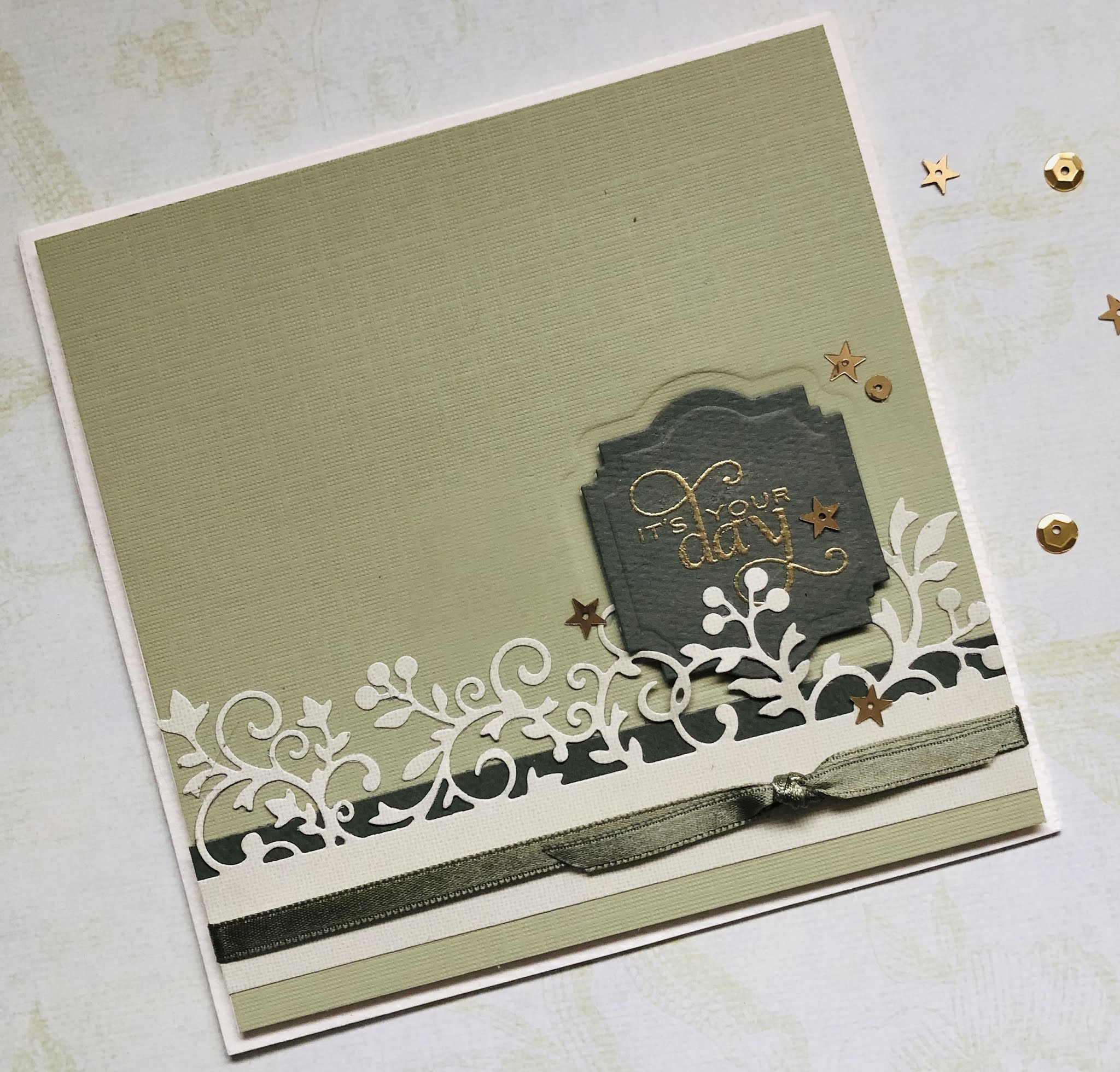
GREEN X3

I've been wanting to participate at a Seize the Birthday challenge for a while, but have waited too long and missed several deadlines. Today, having been on a card kick the past several days, I finally got it done under the wire. The topping for the birthday card this week is "3 shades of green". While this actually is 3 shades of green, my i-phone couldn't quite capture the lightest of the greens - a pale putty/celery color - so it looks more like 2 greens and an ivory.


I'm usually more active on the CAS challenges but sometimes it's a nice change of pace to do a more elaborate card with layers and embellishments. The sentiment shape is an old die and I have long-forgotten the manufacturer. The filigree die is one of Hero Arts "Fancy Dies". The sentiment is from PTI's "Star Prints", embossed with Stampendous "Pirate Gold" and embellished with some gold sequins and dark green satin ribbon.  

Thanks for stopping by!
Fran


Saturday, March 13, 2021

SHAPES

This 2-week period of Addicted to CAS is all about "Shapes", hosted by Raga. I had quite a bit of trouble trying to come up with an idea for this card - not because it's a difficult concept but because I hardly knew where to start because so much can be done with it. 

I zeroed in on this interesting 2-sided tribal paper, wanting to use the triangles on the black & white side and the circles on the red & orange side. When I started working with it I thought it looked like Native American or African symbols and then remembered this old Kokopelli wooden stamp I had hidden in some box somewhere. I found it, die-cut a circle out of the face of the card and inserted an orange one in its place then stamped the dancers with Memento "Tuxedo Black" ink. I was amazed to see that the symbols on Kokopelli's garments mirrored the images of the paper. I blind embossed the sentiment with white on orange cardstock and pasted the strip onto a 1" strip of the patterned paper. I made a matching custom A2 envelope with the two-sided paper.


I'm hoping all of you have fun with this code word and don't overthink the challenge like I often do!

                                            Addicted to CAS: Challenge #193 - Shapes


Friday, March 12, 2021

HELLO, SPRING

I know it's not "officially" spring, but it certainly looks like it out my window this morning. The sun is shining brightly and leaf buds are forming on the lilac bush and apple tree. I'm looking forward to seeing the bees arrive, so I chose that image for the black & white inchie challenge at AAA Cards. I suppose I cheated a little by adding a tiny bit of yellow, but I was compelled - the sunshine made me do it!


The challenge was to keep all of the image and sentiment within a 1" square or circle. I started with a 1" square formed with dots from an old stamp set that is long-forgotten. I turned it on a diagonal and added the bee from another set and then the tiny sentiment from my new favorite Hero Arts #CM351 set. I finished by raising a top layer with a slightly larger die-cut square and a length of yellow twine. I lined a matching manufactured envelope with some yellow dotted paper from my stash. Ready to greet spring!


Saturday, March 6, 2021

SHAMROCKS

 Hello, all. 

I've been thinking about my mom today and her propensity for finding 4-leaf clovers. I don't know how she did it, but I came across one of them recently and put it into a tiny frame as a special gift for my son to remember her by.

It's a lovely almost spring day and here I am sequestered in my office instead of being outside tending to some garden cleanup. But it rained all night so it's still very wet - I'm telling myself! I'm taking advantage of a quiet spell to play a bit with my stamps and paper. I partially cleaned up the office this morning and then started in on the current CASology challenge and now it looks worse than when I started cleaning up. It amazes me that I can make such a mess to turn out a single CAS card.

The team at CASology is using the code word "Luck". I've been working all week on my personal St. Patrick's Day cards (this isn't the card I'm sending out in bulk) so I have shamrocks on the brain. I used some older stamps that I've used quite a few times over the years, but mixed them up a bit.


I started by stamping this shamrock image from Prickley Pear with PTI's "Pinefeather" dye ink and coloring it with a Copic marker and white jell pen. Then I gold embossed the Impression Obsession sentiment on a scrap of vellum with little metallic flakes in it and used a straight edge to tear the edges. I punched a couple of small holes through both layers and threaded a green/gold metallic ribbon through it and mounted it all to a Strathmore water color card. 


Saturday, February 27, 2021

ADDICTED TO CAS #192 - ANIMAL

Vicki, our current ATCAS hostess, has chosen "Animal" as the code-word for our challenge #192. I think you'll have fun with this one! I realized I don't have very many animals represented in my stamps and dies - which seems strange for an animal lover! 


I settled on the image of a fox for 2 reasons: 1) this is a Papertrey Ink stamp set that I've had for at least 5 years but have only used the leaves and 2) I was also inspired by CASology with the code challenge "Fox". Until I saw the word fox I had forgotten I had this set. Because the fox looks like a pup, I thought this would make a good new baby card.


Most of this card is made from PTI products - the stamp set "Stylized Autumn", "Ocean Tides" ink, and the Tiny Tags dies. The fox is printed with Memento's "Potter's Clay" dye ink. The envelope lining and ribbon are both from my stash.


I'm anxious to see what animals all of you will come up with!


And for the CASology Challenge:


CASology: Week 384: FOX


Added 3/02/21:


Thursday, February 25, 2021

LIVE SIMPLY

With a little bit of extra time this morning I sat down to my desk and played a bit with the current Freshly Made Sketches #474. This is a favorite image of mine, as it looks like my Sweet Sara! I have no idea who manufactured this stamp set. 


I fussy-cut the dog and bone after printing them and used red and black markers to make eyes, nose, whiskers, collar, and heart. The tan ink is PTI's "Fine Linen" and the sentiment is from PTI's "Winter Hills" stamp set, stamped in Memento "Tuxedo Black". The envelope was made with PTI's printed paper in "Fine Linen".