Monday, March 7, 2022

BIRTHDAY SILHOUETTE

 AAA Cards Challenge has a new challenge out this week - Game 210, Sketch + Silhouette. Tomorrow is a friend's birthday, so I used the challenge as inspiration for a masculine card for him.


This image with three Kokopellis dancer/flautists silhouetted is from the very beginnings of my stamping days. They were originally attached to a wooden block, but I couldn't get a clean enough image stamped, so a couple of years ago I pulled them off the wood so I could use them with my Misti. I started this card with ivory cardstock. I die-cut a circle in a piece of light paper and blended Hero Arts "Butter Bar" (love that color) and PTI "Orange Zest" as the background shape. I followed this by a Tim Holtz spatter stamp with Orange Zest and finished with the three silhouettes in Hero Arts "Black Tuxedo". The sentiment is a colored strip of paper woven through a couple of openings in the face of the top layer.

I had this scrap of rice paper with Native American symbols on it that has been in my stash for quite a long time. It seemed like a good choice for an envelope/wrapper for the card. I reinforced the flap with a couple of cardstock circles and a black eyelet and threaded black twine with beads through it.


Thursday, March 3, 2022

#CARDSFORUKRAINE

The kind hearts over at Color Hues Challenge have offered up a challenge that is hard to not participate in - making a card to show our love and support for the people of Ukraine. This is a small act, but it beats feeling completely powerless. If I can be permitted to use  Nancy Leppek's (owner/creator of the Color Hues blog) words, we are "lighting up the world one card at a time". 

So, to the brave citizens of Ukraine, this is my offering to you:  


The colors of the Ukrainian flag are blue and yellow, and the national flower is the sunflower. I didn't find a sunflower stamp or die in my stash that felt appropriate, so I decided to use one of my favorite stamp and die sets from PTI: "Lovely Layers". I used Hero Arts "Butter Bar" and PTI's "Blueberry Sky" and "Enchanted Evening" dye inks. The sentiment is from PTI's "Beautiful Butterflies". What a perfect set for my personal "Butterfly Effect" statement in this time of chaos.

Color Hues: Color Hues-Special Double Challenge (colorhuesthecolorchallenge.blogspot.com)


Sunday, February 27, 2022

FUSION/BIRDS

This will be my last post for a couple of days - I really do have to get some things done! But it was hard to resist the beautiful birds over at Fusion Card Challenge: Color Palette - Birds.


I fussy cut my birds from Penny Black's "Wreath Whimsy" after coloring them with Copics. Afterwards I was wishing I had used Prismacolors instead because of some bleeding on the watercolor paper I used. The rest of the card is pretty self-explanatory, with the exception that I stenciled a bit of pattern on the tan paper with some VersaMark watermark ink so that it wouldn't be quite so flat. The colors are a bit brighter than the photo, but the light is a bit low today as we are expecting some rain (Yaay!).

Here's the beautiful photo as inspiration for the challenge:

Fusion Card Challenge: FUSION - Colour Palette: Birds


Added on March 3, 2022:


Saturday, February 26, 2022

Q IS FOR QUIRKY

I've been ruminating on this card for a while, not knowing exactly where to go with the most recent challenge at The Sisterhood of Snarky Stampers #204 - Q is for Quirky. I had this Katzelkraft centipede stamped and paper-pieced for some time without a real idea of what to do with her. This morning I decided that she was definitely "quirky" and appropriate for use. 


I masked her off and stenciled a Tim Holtz background around her, die-cut her with a stitched rectangle, and tied a scarf around her neck so she wouldn't be over-shadowed by Edna. After composing a silly sentiment and printing it on my computer, I cut it into a strip, glued on additional strips of printed papers and a black mat around Agnes, and that was it. Don't be surprised if Agnes makes future appearances since she's quite proud of herself!


Added March 8, 2022:


WILLIAM OF ORANGE

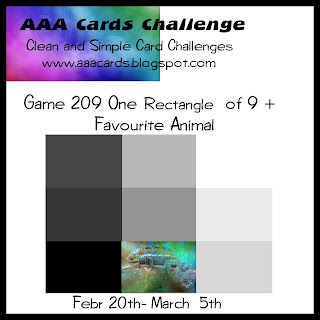
Inspired by the current AAA Cards Challenge #209 - 1/9th + Favorite Animal, I set out to make a card to honor one of our favorite cats of all-time, William of Orange. While he's lost, he'll never be forgotten. I also memorialized him with this card.


And to say that this is a CAS card is an understatement! The challenge was to use only 1/9th of the card. I have these old favorite stamps from Inkadinkado of many years ago that I just can't seem to purge from my supplies. This little guy has shown up on several cards over the years. I stamped him with Hero Arts "Butter Bar" and tinged the back a bit with a tiny bit of PTI's "Orange Zest". I used a fine black pen to color in his nose, eyes, and whiskers. I took a bit of poetic license with the black nose and whiskers - William had a pink nose and white whiskers - but I wanted to match to the sentiment. My final step was to use a radius corner punch for the bottom right corner and to line the inside with a bright yellow-orange paper. 

I didn't have an envelope to fit this 4x6 format, so I made one with a piece of color-coordinated scrapbook paper, using the white side for the outside of the envelope. 

The single word sentiment from Hero Arts #CM351 also qualifies me to enter it into Less Is More #459 One Layer Card - Just One Word


AAA Cards: Game #209: 1/9th + Favourite Animal  


"Less is More": Challenge #459 - One Layer Card (simplylessismoore.blogspot.com)


So, here's in memory of William of Orange - sweetest and naughtiest kitty in the world!


Friday, February 25, 2022

UNSUPERVISED

You know how sometimes an idea just pops into your head and it all flows easily from there? That's what I experienced with this card, inspired by Cécile's sketch at Freshly Made Sketches #524. Last night, as I was dropping off to sleep, I was thinking about the sketch and how I could utilize one of Tim Holtz's Snarky Cats because I'm taken by the shape of the fish bones, which I thought would be a perfect image for the corners of the rectangular shape. I awoke remembering my idea and knocked this out in about an hour.


I started this little guy with a gray cardstock rectangle that I stamped him on with black ink. Then I colored him with Prismacolor pencils and white gel pen and masked him off to use a stencil with Hero Arts "Wet Cement" ink for a background rectangle. After this all dried, I heat embossed Tim Holtz's fish bones and the sentiment with white embossing powder. My final step before matting the front with black and gluing it to the face of a white side-folded card, was to add some white threads to the tail of one of the bones to give the impression that this is really a naughty cat! My kitties cannot be trusted with any spools of thread left un-attended, so the tangled background stencil and threads are straight out of their bag of tricks! I have a good friend who is a real cat lover and she's getting this card.

Freshly Made Sketches: Freshly Made Sketches #524 - A Sketch by Cécile


Tuesday, February 22, 2022

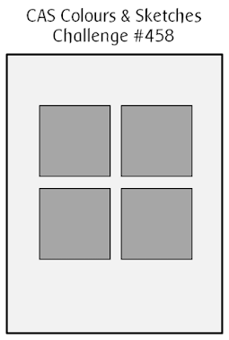
CAS COLOURS & SKETCHES #458

This is my final week with CAS Colours & Sketches as Guest Designer and this week's challenge is a sketch. 

CAS Colours & Sketches: Challenge #458 - Sketch (cascoloursandsketches.blogspot.com)


I want to thank the CCS Design Team for the invitation to participate as a Guest for the month of February. It's been a real honor and a joy!


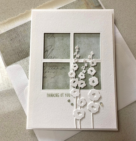
I LOVED working with this sketch! Using a pre-folded 5x7 watercolor card, I die-cut 4 individual squares from a matching piece of card stock - no easy task to get these straight! I stamped the sentiment from Hero Arts #CM317 with VersaMagic "Sage" chalk ink and mounted the top layer over a piece of printed cardstock from my stash, using dimensional foam. The final step was to die cut the hollyhock stems (Impression Obsession #DIE169-R) twice and double-layer them for more dimension. I made the little dimensional dots by punching very small circles out of the same sage cardstock and then dotting Ranger Glossy Accents over them.

Because I had so much fun with this one, I'm sure everyone else will as well and I'm really looking forward to seeing the results!

Since this is made with mostly dies, I'm also entering it into the February challenge at Happy Little Stampers - Anything Goes with Dies.


Sunday, February 20, 2022

TAKE A HIKE

This is my second unintentional card for the day. This time I was playing around with the cake image over at Color Throwdown #680. I decided to use thin paper and just tear it for the mountain images. I had a hard time gluing the edges because my tape runner just kept pulling up the back of the paper, so I decided to leave well enough alone. 


After gluing the mountains and a die-cut dark green slope to white cardstock, I die-cut a stitched rectangle out through all of the layers, added die-cut trees from Alexandra Renke's "Winter Village" die set, and heat-embossed the sentiment (Simple Stories "Great Escape") with white embossing powder. I glued this to a top-folded white card that I had attached a band of brown wood-patterned paper to. That's it. I was disappointed with the color renditions from my cell phone camera - the dark green looks black.


LIVE SIMPLY

This morning's card is a sweet one inspired by the current sketch at Freshly Made Sketches #523. I'm sliding it in just under the deadline. I hadn't really intended to make a card yesterday, but I went into my craft room/office to clean it and... well, the room is still a mess!


I've been looking at this sketch since it was posted and couldn't get inspired. Then I started thinking about birds and nests (it's nearing the beginnings of spring). The closest image I have to a bird nest is this small wreath from Impression Obsessions. Starting with an ivory side-folded card, I cut a second rectangle from the same card stock and stamped the wreath three times - twice with PTI "Fine Linen" and the center one with PRI "Dark Chocolate". I used a green Copic marker to fill in the leaves on the center wreath. I then die-cut a smaller stitched rectangle from the wreath layer and popped it up with dimensional foam. The little bird is one of my favorite dies (I believe it's from My Favorite Things) and I cut him from some aqua scraps. I popped him up with a bit of dimensional foam and added the little tag, stamped with a sentiment from PTI's "Winter Hills" set. The final step was a natural flax twine tie.


Freshly Made Sketches: Freshly Made Sketches #523 - A Sketch by Jen B


Wednesday, February 16, 2022

J IS FOR JUDGMENTAL

I'm playing along with the Sisterhood of Snarky Stampers today. Their current Challenge #203 is "J is for Judgmental" and I just wouldn't feel right without showing off one of the stamps I selected from Lost Coast Designs as my winnings for the January challenge! This is their "Fifties Girl" rubber stamp. I stamped it in black, colored it with my Copics, and fussy cut her out.


The snarky sentiment is from Unity Stamps, which I heat embossed in white. This was all pretty straight forward and CAS.
 

Sisterhood of Snarky Stampers: Sisterhood of Snarky Stampers #203 -- J is for Judgmental


Added on February 22, 2022:


BLACK & WHITE + 1

I've been ruminating about when a card is no longer CAS. It seems like it might be a very fine line that I sometimes cross over - this just needs one more bead or a piece of ribbon or an extra layer. I think that may be the case with this card that I created, inspired by the current AAA Cards Challenge #208 Color Scheme - Black, White + One Color. Well, we'll see if it gets deleted from the entries!


This card was started with a bright green square of cardstock that I die-cut using a Penny Black #51-423 "Airy" die. I then divided it into quarters and mounted them on a black square. I added a sentiment and some splatter with white embossing powder and mounted this to a white square mat. It felt like it needed just one more layer, so I added the same die over the top in white cardstock - and because I couldn't leave well enough alone, on went two black gems. To be, or not to be CAS!


AAA Cards: Game #208: Color Scheme : Black, White + One


Tuesday, February 15, 2022

CAS COLOURS & SKETCHES #457

It's week 3 of my Guest Designer role over at CAS Colours & Sketches, and this week is a color challenge:

http://cascoloursandsketches.blogspot.com/2022/02/challenge-457-colours.html


When I saw "Merry Merlot" I knew I had to bring out some of my wine stamps!


This image and sentiment are both from Unity Stamp Company. I started with an ivory cardstock that I cut to make a 5 1/2" square top-folded card. I stamped the image on the face of the card with PTI "Dark Chocolate" and colored it with Copic markers. I also printed it onto some lightweight gold stock and cut out the label to paste over the bottle, although it doesn't show up well in my photo. I added a bit of gold opaque ink, which also isn't really noticeable in the photo. The sentiment is heat embossed with gold powder on dark brown stock and die-cut with a very old die. I cut a 5" square piece for the face and die-cut an oval from it and edged the square with heat embossed gold powder, tied the label on with natural and gold baker's twine, and mounted it all to the face of the card with dimensional foam.


Your turn!


Monday, February 14, 2022

GOOD MORNING & HAPPY VALENTINE'S DAY!

Good morning, all! 

Some years ago I had a DeLonghi espresso machine that I made my morning latte with. After steaming the milk, I would add a shot of espresso. One morning I looked down at my coffee and saw this almost perfect heart, which I of course had to photograph. I offer this to you this morning on St. Valentine's Day with my wishes that you all have a wonderful day!