Monday, January 31, 2022

MORNING COFFEE

 A couple of years ago I started weaning myself off of excess coffee and am finally down to a single cup every morning, which I think makes it especially appreciated! I make myself a single cup of latte each morning to greet the day.  It's particularly special on the days I meet a friend at one of our favorite nearby coffee shops. But as much as I love my coffee, I seem to have a hole in my cardmaking supplies with regard to coffee - now wine is another story! 

All of that to say that this morning's card offering is inspired by the year's first Fusion Card Challenge - "Coffee Chalkboard". To say that this card was a struggle for me is an understatement. I think I worked on it almost all day yesterday after having decided not to participate in the challenge. But thumbing through some very old stamp sets I found this single coffee cup among some Inkadinkado "Inchies" that remained mostly unused over the years. Try as I might, I couldn't manage to convert this single image into a coffee shop chalk board, so I decided to use it alone in the sketch challenge. 


I started with some printed dark gray paper that was slightly grungy. It's a very light-weight paper so I adhered it first to cardstock so that the stitched rectangle would have a bit of dimension to it. Then I went in search of something akin to newspaper and all I could find was a scrap of cardstock with the image printed on a gold linen. I copied it with my copier in black only and liked the gray paper that came out. This I glued to the face of the pre-die cut rectangle and cut an opening with a stitched circle die from LDRS Creative. I stamped the sentiment from Hero Arts #D1598 Color Layering "Sea & Sky" and heat embossed it with white embossing powder. I did the same on the circle I cut out from the face of the card and die cut it again with a slightly smaller circle die. Everything was mounted onto a white card base, and I colored the coffee cup with a yellow-gold Prismacolor pencil. The final step was to use my anti-static powder bag to rub on some white powder to make it look like chalk. It's such a simple card that I have no idea why it took me nearly a day to create!

Saturday, January 29, 2022

CAS VALENTINE

This morning's offering is a CAS design inspired by the Tic Tac Toe Challenge #146 and I think I've finally hit on the design I want to use for my personal Valentine's greetings - it's quick and easy and I can make it from already existing materials, using scraps from my "pink" drawer.


I chose the left down position - pink/valentine or heart/white. I first stamped the sentiment from Hero Arts #DC175 "Love Stamp & Cut" with PTI "Berry Sorbet", and die cut a small rectangular opening (Dare 2B Artzy "Rectangle Framelit") in the face of a pre-cut rectangle of white cardstock. I mounted this to a top-folded white card base, inserting a scrap of PTI's printed paper behind and inserted the white die-cut heart from Penny Black (#51-182 "Fancy Heart"). I glued on three sequins, and it was finished - it doesn't get any easier than that! I just need to decide how to finish the inside and get busy and produce 26 more. I'm thinking they will each be slightly different, depending on what scraps are available for behind the window opening.

TTTC146 - Featured Designer LeAnne - Tic Tac Toe Challenge


Added February 5, 2022:


Friday, January 28, 2022

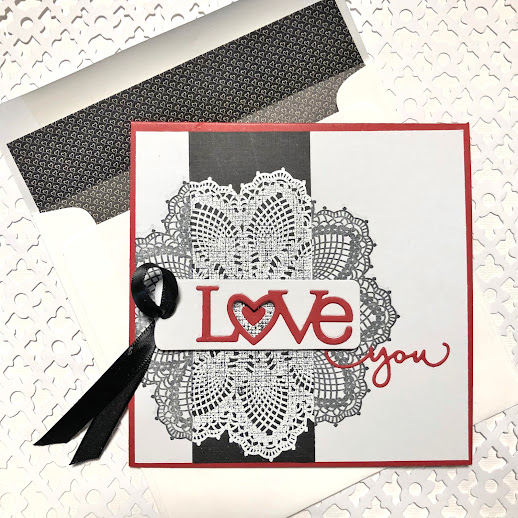
MORE LOVE AND HEARTS

Back again with yet another valentine using old stamps and dies. This is my second attempt at this particular sketch at Freshly Made Stamps #520 - Sketch by Jen M. While my personal style has evolved over the years more toward CAS, it's fun to occasionally take on a design with more elements. 


I decided to use Stampin' Up's "Hello, Doily" image as the circular element and play with it in positive/negative black and white. I started by stamping the doily with Memento "Tuxedo Black" ink on a bright white cardstock square. When it was sufficiently dry, I laid over a strip of black card stock that I had heat embossed the doily with white embossing powder to provide the vertical stripe. I overlapped all of this with a white cardstock tag (Stampin' Up "Framelits - Chalk Talk"). I die cut the sentiment from the tag, knocked out the heart, and glued it back in with red card stock. I pulled some black satin ribbon through a hole I punched in the tag and attached this all to the face of the card with some dimensional tape. The final step was to add a small heart into the opening of the sentiment and "you" (from Alexandra Renke) in red card stock, and mount all of this to a top-folded red 5-1/4 x 5-1/4" card base.

As I noted above, this was my second attempt with this layout. I was getting tired of pinks and peaches and thought it was time to do something a bit more dramatic. The envelope is lined with a black and white printed paper with tiny hearts that I found buried in my stash.     


BACK TO VALENTINE'S CARDS AND BROKEN PROMISES

After a brief respite from valentines, I've been really cranking them out the last couple of days. I've been using several challenges for inspiration to hone down what I want to send out to all of our friends and family for this year's Valentine's Day greeting. I promised myself not to buy any special Valentine's Day supplies this year, but alas, promise broken! So, here's the first one with a new stamp set and a couple of new dies.


The inspiration for this one can be found over at the Color Throwdown Challenge #677 - pink/purple/green. I started with white cardstock and VersaMagic chalk ink in "Purple Hydrangea" to stamp a wreath from Penny Black's "Wreath Whimsy, which I then colored with pink and green Copic markers. The next step was to die-cut the cardstock with a stitched rectangular die and cut out the stitched circle from LDRS Creative. I attached this to a white card base with some dimensional foam, inserting a scrap of purple polka dot paper behind. I diecut  the "love" sentiment (Hero Arts #DC175 "Love Stamp & Cut") from pink cardstock and glued it over the wreath, threading the e with a small tag. To get this small tag, I used one of the Dare 2B Artzy "Rectangular Framelits" and shortened it by double-cutting.


This close-up shows how I had problems with the sentiment when trying to insert the last letter through the tag - HA! It bent in a couple of places. The sentiment and heart on the tag are both from the Hero Arts set.


Wednesday, January 26, 2022

LET'S UNCORK

I took a break from valentines today to have some fun with the CASology Challenge, week 339: "Renew". I hadn't intended to participate this time around because I was short on imagination with the new cue word. Then yesterday I received a shipment of some Unity rubber stamps I had ordered, and I had a "Eureka" moment with this #18-427 "Lets Uncork". It seemed appropriate.


This was an incredibly fast and easy card to produce. I stamped the image on a piece of white card stock and colored it with my Copic markers and white gel pen, and die cut the image with a Dare 2B Artzy "Rectangle Framelits" #D148. I cut a second white mat and mounted them both toward the top left corner of a top-folded white card. Finally, I heat-embossed the sentiment onto a scrap of wine-colored cardstock with white Stampendous embossing powder, die cut it with a small rectangle, and mounted that to the right side of the card with dimensional foam. The envelope is lined with a bit of light-weight wine-colored paper.  

So, back to valentines!

CASology: Week 399: RENEW


Sunday, January 23, 2022

TWO TAKES WITH THE SAME DIE

Hello, all. This morning I started out working on a cream, red, and gold valentine for the current Color Throwdown #676 and ended up segueing into another card using the same old favorite PTI die. I'm saving a bit of time by posting both of them together rather than going to two separate posts.


I started this first card with some textured cream card stock from LCI with matching envelope. This design is similar to one I was playing around with a couple of years ago. I stamped the cancellation image first with PTI "Pure Poppy" ink and applied a postage stamp outline die cut from the same card stock and stamped again to overlap ink and die. I then die cut several layers of the "Love" image from PTI's "Wonderful Words" from gold cardstock, but I wanted it to be brighter, so I smooshed the word into some VersaMark watermark ink and used Stampendouse "Pirate Gold" embossing powder over the face of it. I inserted a red card stock heart behind the word after overprinting it with the postal cancellation stamp. It was finished off with a couple of gold heart dies. I lined the envelope with some scraps of valentine paper from years ago.


I'm entering this card into both the Color Throwdown challenge and Time Out #205 - In Love".


Added February 3, 2022:


For a completely different look, my second card using the same die was done primarily to enter the current Freshly Made Sketches #519. I used an old PTI image from their "Love & Marriage" collection and stamped it on a piece of white card stock with Memento "Gray Flannel" ink - which looks darker in the photo than it is. I matted it with some red dot paper and silver foil to the face of the side-folded white card. I then die cut several of the "Love" sentiments from white card stock and layered them over the face of the tree image with a red dotted heart filler and added a final top layer of silver foil. I stamped "Lots of" on card stock with "Pure Poppy" and punched it out for a tag that I attached with some silver thread.


Added January 25, 2022:


Saturday, January 22, 2022

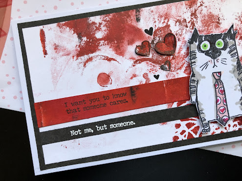
SOMEONE CARES

When I was asked to Guest Design at The Sisterhood of Snarky Stampers #202, I was delighted! But then I was told about this 2-week challenge, and I had a bit of trepidation - "G is for Gel Printing". I've never done any gel plate printing and didn't have the slightest idea how to proceed. So, I watched a bunch of YouTube videos and ran off to Michael's waving my Christmas gift card and invested in a gelli plate, brayer, and small set of acrylic paints.


Since I am currently in my Valentine card phase I decided to limit myself in colors, which I can see yields a less interesting background. Next time I do this I'll tackle a bit more color and pattern. I used only Crimson Red, Vermillion, Titanium White, and Black. The first couple of prints I pulled were pretty boring, but this background came from a ghost print of a deeper red first try. I decided to use it anyway and see what I could do with it.


I stamped part of the sentiment from Tim Holtz with Memento "Tuxedo Black" ink onto a strip of the darker gel print (In retrospect I wish I had heat embossed this sentiment so that it would show up better against the red.). I did heat emboss the last line with white powder on a black paper strip and mounted both of these to the gel printed background. I decided to add a tie to the Tim Holtz Snarky Cat that I had previously used for my brother's birthday card and then I had fun coloring it with Copic markers and stamping tiny hearts into the white polka dots. I fussy cut him out and mounted him with dimensional foam to the face of the card, which I then mounted with a black mat to a folded slim-line card. I added several hearts, some directly to the background and some layered for dimension. 

My final bit of fun was to custom make a coordinating envelope lined with Valentine printed paper. I added a sentiment from Photoplay #S152150 "Made by Me" to the back of the envelope just below the flap.


And that's my first foray into gel printing. I look forward to seeing what everyone else comes up with!


Thursday, January 13, 2022

THINKING ABOUT VALENTINES

It's time to start thinking about my Valentine's Day cards. This is the first one of the season and it's for my husband. For inspiration I used the current layout at Freshly Made Sketches - #518, A Sketch by Judy".


I trimmed a piece of white cardstock to 5" square and stamped the daisy image from PTI's "Friends Til the End" with Memento "Black Tuxedo" ink. I haven't used this stamp set for a couple of years, but it is one of my old favorites. I then colored the center of the daisy with black and pink markers and die-cut the sentiment from PTI's "Wonderful Words: Love". I cut several more layers in black cardstock and glued the layers together, finishing the center of the word with a small die-cut heart threaded through with black thread and a couple of beads. This was all mounted with a slightly larger bright pink square mat to the face of the folded card.


The final step was to add some printed pink paper on the inside with a die-cut sentiment from Alexandra Renke.


I've decided to enter this in a couple of other CAS challenges.

Freshly Made Sketches: Freshly Made Sketches #518 - A Sketch by Judy

Happy Little Stampers: HLS January Anything Goes with Dies Challenge


Added January 18, 2022:

Sunday, January 9, 2022

SNARKY CAT BIRTHDAY CARD

On Friday afternoon I followed through on my New Year's resolution of "more snark" by hitting an after-Christmas sale at Joanne's and purchasing a couple of Tim Holtz "Mixed Media" Collections (clear stamps with layering stencils) of his Snarky Cats. 

My younger brother has a 74th birthday coming soon, and I think he'll appreciate this card - he's a pretty good sport! I used three challenges for inspiration: Just Us Girls #614 Trend Week - "Inked or Sprayed Backgrounds", Seize the Birthday #229 - "Blue and Gray", and SoSS Challenge #201 - "I is for Ink".  


I struggled a bit with my phone camera, not quite matching the colors of the original card. The top layer is a pale blue that comes across as more gray than it is. I started with a 5-1/2" square side-folded white card and a 5" square of pale blue card stock. Using the stencils from my new Tim Holtz, I applied a layer of Memento "Gray Flannel" and a layer of PTI "Blueberry Sky" circles with a blending sponge, followed by a layer of splatters in Gray Flannel. I over-stamped the sentiment in Memento "Tuxedo Black" and adhered this to the face of the card base. I die-cut a stitched circle through both of these layers, exposing the inside of the card. The final layer on the face of the card was the die-cut numbers from PTI.

I also did a bit of stamping on the square envelope. My family name is Poe and some years ago I purchased this "Poe-Stage" rubber stamp from Stampfrancisco and I always put it somewhere on the envelope on all mail sent to family members. I added some blue splatters.  


My card design style tends more to the CAS side, so while this all seems pretty tame by normal grunge standards, for me it's quite daring to smush ink randomly - even when it's only 2 colors. Once the front was completed, I opened the card and stamped the inside so that the cat could stare out from the little porthole in the front. Once stamped in black and colored with Copic markers, I masked the little guy and his deflated balloon and stamped a splatter in Blueberry Sky.

Here are the challenges I used for inspiration:

"Just Us Girls" Challenge: Just Us Girls Challenge #614 - Trend Week


Added January 25, 2022:


AAA GUEST DESIGNER

I'm very pleased to be included in AAA Cards Clean & Simple Challenge #206 as Special Guest! I like the new mood board concept for 2022. Given that as I write this we have been under a layer of snow, it was hardly a stretch to come up with an appropriate image as suggested by the mood board!


I've been on a jag lately of mini slim line cards - I'm really enjoying the scale of these little cards - so decided to go with the smaller format for this card. I think I mentioned in an earlier post that I have now made an envelope template to fit. The finished card measures 3-1/4" x 6-1/4". I started with a white side-folded card and added a slightly smaller metallic blue stock on which I had heat embossed the sentiment from Penny Black's "Merry Up" with Stampendous! "Detail Silver" embossing powder. The die-cut snowflake is also a Penny Black product - #51-561 "Snowflake Tag". I die-cut the outline of the tag from patterned metallic white cardstock and then die-cut the interior snowflake from the larger outline. After adhering the larger tag to the card and trimming the right edge, I threaded a scrap of silver narrow ribbon through the center hole of the snowflake and glued this to the card, adding some dimensionality. This photo shows the various metallic elements:


Here's the link to the challenge. Take a look at the beautiful cards the Design Team members have created and try your own hand at it!


Tuesday, January 4, 2022

STARTING THE YEAR WITH A SNARK

I've been following The Sisterhood of Snarky Stampers for a couple of months, hoping to participate on a regular basis, but mostly my resources aren't particularly snarky. I can see that may require a New Year's resolution - more snark (not to be confused with "more cowbell")! Well, today is my first foray into snarkiness for 2022 with SSS#200 - "S is for Snarky". I used a couple of stamps from Riley & Company that I purchased a couple of years ago for St. Patrick's Day.


This started as a 5-1/2" square side-folded card. On a separate piece of cardstock, I stamped this Riley & Company #FBP-019 with Memento's "Tuxedo Black" ink. I applied PTI "New Leaf" with a Tim Holtz Collection stencil and blending brush as a background. I slipped this layer between the card base and a 5" x 5" square that had been die-cut with an oval. I felt like the hand and cup needed to be accented more, so I re-stamped the image, fussy-cut the cup and hand, colored it with Copics markers, and attached it with dimensional foam.


The final step was to heat emboss the sentiment (Riley & Company #RWD-695) with Stampendous "Detail Black" powder onto a strip of dot-printed paper. I radius-trimmed the right side of the strip and punched a hole to thread black and white baker's twine around the card front and glued it in place. I also slipped a small piece of the dotted strip at the left side between the layers for more dimension.

So, here's to 2022 snarkiness:


I'm also sending this over to Just Us Girls Challenge #613 - "Beverage"


Added January 11, 2022:


Saturday, January 1, 2022

2021 IN RETROSPECT

I have to admit that I am positively giddy about seeing 2021 in the rear-view mirror! Of course, I felt the same way about 2020, not knowing at that time that we would still be in plague mode through 2020 (and 2021). 

2021 was saddened by the loss of our beloved Sara in May and we're still feeling a bit tender around that event and not quite ready to jump into inviting a new dog into our home. Our kitties continue to delight us with their playful antics.


But, despite the above I have much to be thankful for going into the New Year. My husband and I are still healthy, as are our son, daughter-in-law, and our three grandchildren. And, while my brother and his family in West Virginia all caught COVID, they each recovered nicely - no one was hospitalized. 

2021 was a very productive year from the standpoint of cardmaking - I served the year on the Design Team for Addicted to CAS and participated in many challenges that stretched my abilities. I did a couple of fun Guest Designer shots for Just Us Girls and AAA Cards. The international cardmaking community is a loving one. I've really enjoyed the contact with such creative and thoughtful people and will continue my participation into the New Year. I'm also very thankful for my followers who have been so generous in their encouragement.

On the home front we entered 2021 with a newly renovated kitchen that we are really appreciating - the above card and envelope were created using leftover wallpaper from that project! As we go into 2022 our project for this year will be to have a new solar system installed, but it will require a new roof first. Hopefully, that will all be in place by April.

Summing up, 2021 brought some sadness and more blessings, but I'm still looking ahead to the New Year very thankful that that year is behind us.

My thoughts go out to anyone who sees this message in the hope that 2022 brings peace and prosperity and good health to you and your loved ones!

Fran Wing